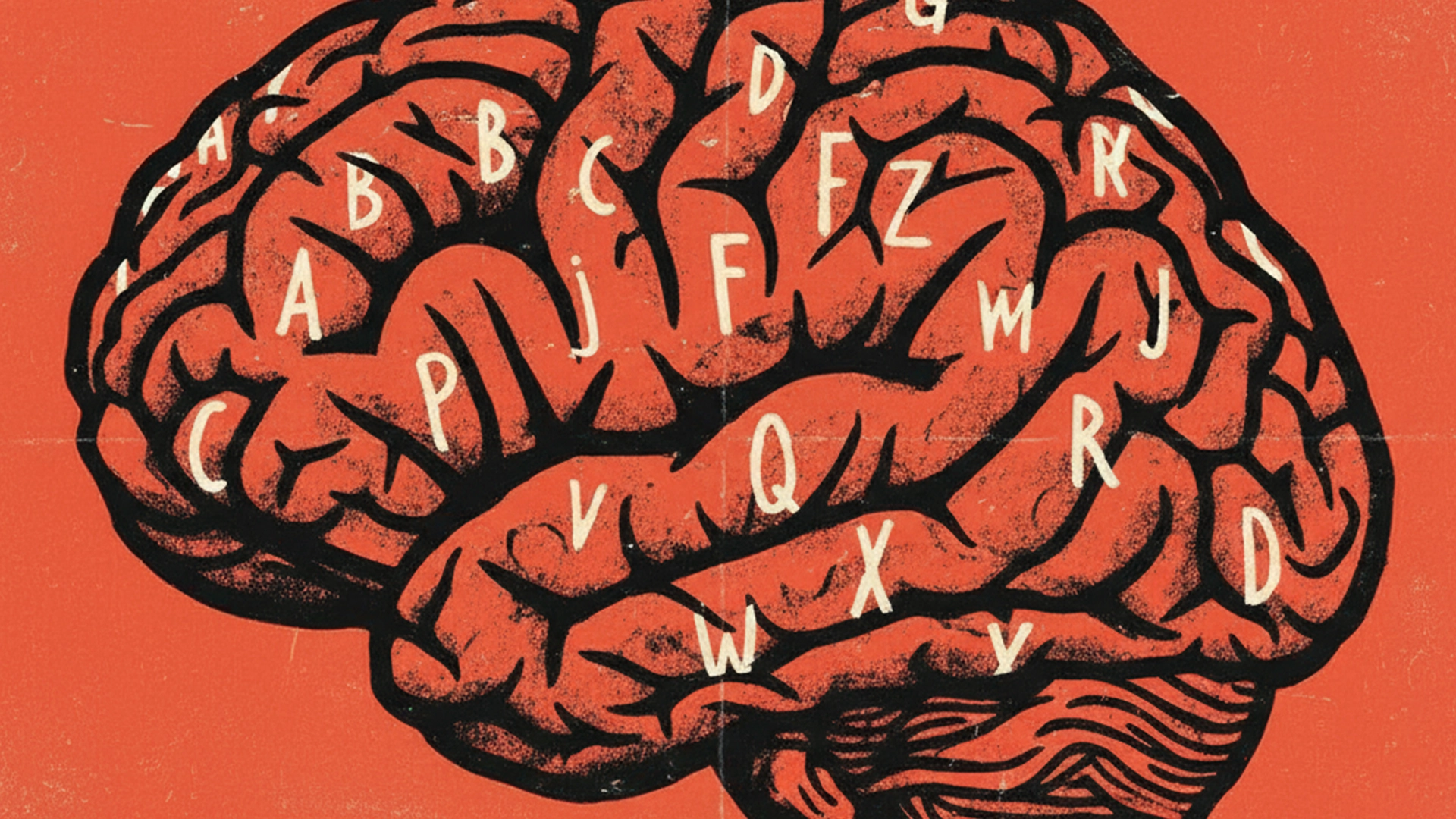
This Halloween, we’re spotlighting one of design’s most powerful and often overlooked tools: typography. Just like a scary story hinges on atmosphere and tone, the right typeface sets the mood long before a single word is read.
When designing a brand, typography matters far more than just finding a font that looks pretty. The style of type can unconsciously communicate a host of things—tone, formality, credibility, and emotion.
Would a healthcare benefits company earn trust using ultra-stylized editorial fonts better suited to Vogue? Would a modern fashion retailer convey trendsetting authority using sterile system fonts designed for spreadsheets? (Aptos, which one of us secretly loves)
Type is one of the first things we consider when helping clients express their brand personality. Here are a few things we consider from the start:

Brand Voice: What Does Your Typeface Say?
Typography sets the tone for your messaging. What should your company sound like? Formal or casual? Serious or playful? A classic like Times New Roman “sounds” professional and straightforward—but also feels dated and out-of-touch. On the other extreme, Comic Sans may feel fun and playful, but comes at the cost of credibility (unless you’re producing comic books or google searching it).
The right typeface should amplify the voice of your brand, working in harmony with the copy instead of working against it.

Application: Where Will This Typeface Live?
Context matters. Is the brand digital-first? Print-heavy? Are PowerPoint decks and event collateral common deliverables?
Some typefaces are optimized for screens. Others shine in large-format print or environmental design. A font that works well for the body copy on a website might not be the best choice for printed brochures.
Choosing fonts designed with their intended medium in mind ensures that your message both looks good and also gets through to your audience.

Hierarchy: Does the Type Guide the Eye?
At larger sizes, every detail of a font becomes visible—serifs, terminals, spacing. In small sizes, the way characters are constructed can either help or hinder legibility.
Great typography establishes a clear hierarchy. It guides the viewer’s attention from headline to subhead to body copy, and choosing the right typeface for both large and small formats ensures clarity. Type designers will optimize letters for display vs. body use; using typefaces appropriate for small body copy or larger headlines is highly recommended so your message doesn’t get lost.
Type Is Voice, Not Decoration.
Your brand doesn’t just need to look good, it also needs to sound right. Typeface is a critical part of that sound. When thoughtfully selected, type helps you:
- Express brand personality
- Communicate clearly across formats
- Create a cohesive, consistent experience
Design isn’t just about how it looks—it’s about how it feels. And how it speaks. Reach out if you are interested in brand support — our team is ready to help.
Special thanks to Kristen for writing this post and we hope Farid enjoys the horror!
Typeface: the design or style of a family of characters, including letters, numbers, and punctuation marks, like Neue Montreal.
Font: A specific variation within a typeface, defined by its size, weight (e.g., bold, regular), and style (e.g., italic), such as Neue Montreal Semibold Italic.
Typography: the art and technique of arranging type to make written language legible, readable, and visually appealing in graphic design.

