
In a world overflowing with content, choices, and distractions, simplicity in web design isn’t just a trend—it’s a necessity. A cluttered website is like a noisy restaurant: overwhelming, disorienting, and an instant reason to leave. On the other hand, an intuitive, clean design fosters trust, engagement, and—most importantly—conversions. Let’s explain why simplicity wins and how brands can leverage it for better user experiences.
Cognitive Load & Decision Fatigue: Why Complex Sites Drive Users Away
Ever feel exhausted after scrolling through a website packed with too many menus, pop-ups, and competing calls to action? That’s cognitive overload in action. The human brain craves simplicity—when faced with too many choices or a confusing interface, users are more likely to bounce than engage. If your site is making them think too hard, they’re gone.
Minimalism & UX: What “Clean” Design Actually Means for Conversions
Minimalism isn’t about stripping your site down to the bare bones—it’s about prioritizing what matters most. A simple design puts the focus on core messaging, clear pathways, and frictionless interactions. Less visual noise means higher engagement. Research has shown that simplified, easy-to-navigate websites can increase conversion rates by up to 200%. The key? Make decisions for your users so they don’t have to.
The Role of Typography, White Space, and Navigation in User Engagement
Great design isn’t just about removing distractions; it’s about guiding the user’s eye. Three essential design elements play a major role in shaping the experience:
- Typography: Readability is everything. Clear, well-spaced fonts enhance comprehension and reduce fatigue.
- White Space: Not empty space—intentional breathing room. It helps direct attention and makes content more digestible.
- Navigation: The simpler, the better. Users should intuitively know where to go next without hunting for answers.
A well-designed site doesn’t just look good—it feels effortless to use.
Case Study Breakdown: Brands That Simplified and Saw Results
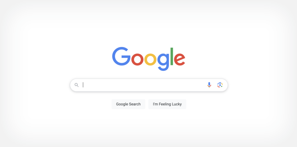
Google – The ultimate example of simplicity. A blank page, a search bar, and the world’s most powerful engine behind it.
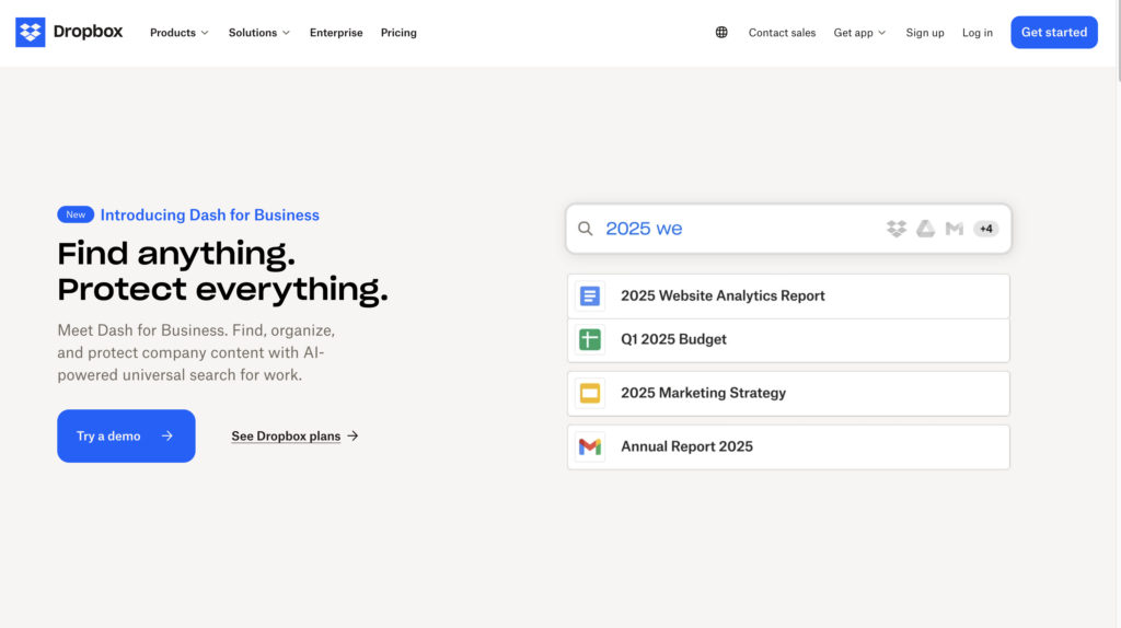
Dropbox – A once-cluttered homepage became an elegant, single-focus design that boosted sign-ups.
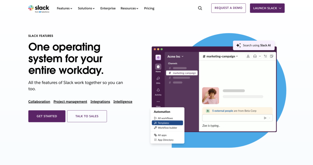
Slack – Known for its clean, intuitive interface that streamlines communication without overwhelming users.
These brands prove that when it comes to web design, less is more (one of Nick’s favorite sayings).
Designing for Speed & Accessibility: Why Simplicity is Also About Performance
A simple website is also faster. 53% of mobile users abandon a site that takes more than three seconds to load. A lightweight design reduces load time, improves mobile performance, and enhances accessibility. Clear layouts, properly structured content, and streamlined code make it easier for all users—including those with disabilities—to navigate seamlessly.
The Takeaway
Simplicity isn’t just about aesthetics—it’s about functionality, clarity, and results. A clean, intuitive design keeps users engaged, drives conversions, and ensures a smooth experience across devices. In a digital world where attention spans are shrinking, the brands that make it effortless to interact will always come out ahead.