
There’s a particular kind of energy that happens when hundreds of designers, strategists, writers, and creative directors gather in one place to talk shop. Inspiration, critique, admiration, and a little insecurity all colliding at once. That was the feeling as we walked into the recent First Round [Brand] Conference.
Presentation after presentation reinforced something we, too, at Fifteen4, deeply believe about our industry: long-lasting client relationships are rarely built on aesthetics alone. The work that lasts, the work that grows businesses, increases loyalty, reshapes perception, and sometimes even multiplies valuation, is strategic first. The visual identity is the vessel carrying that strategy into the world. And despite all the industry discourse around artificial intelligence lately, AI was barely mentioned. Actually, I can only remember one moment where it was openly and hilariously acknowledged.
Alfredo Enciso’s Unexpected Love Letter to Other Creatives
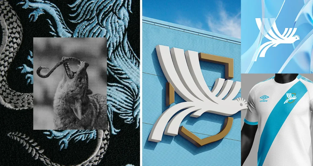
Alfredo Enciso of PUPILA presented the first-round identity work for the Fedefut Guatemala football club. Buried throughout the presentation were unexpected visual mashups blending earlier conference brands with his football identity system.
A 12 Matcha cup suddenly became Fedefut Guatemala merchandise. Genesee beer packaging transformed into football branding. Modestworks’ striking Dallas Trinity Football Club mockups reappeared, reimagined through entirely different club identities. It could have felt like trolling. Instead, it felt Alrefdo saying, “I see you. I admire you. Mad respect.”
Strategy was everything, everywhere, all at once
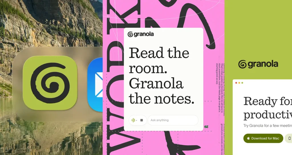
Every identity presented — every logo, type system, color palette, and motion language — was clearly the result of weeks (often months) of positioning work, messaging development, audience research, workshops, and refinement. One quote that stayed with me came from Max Ottignon of Ragged Edge, who presented the brand for Granola: “A messaging deck must be opinionated.” Granola casually distilled its positioning into something almost provocatively simple:
“Tech hippies against corporate slop.”
And the identity fully committed to that worldview. That’s the thing many people outside our industry miss. Great branding is rarely neutral. The brands we remember usually stand for something clearly enough that some people inevitably dislike them.
Motion Is No Longer the Finishing Touch
One of the most fascinating threads throughout the conference was seeing how deeply motion has become embedded into identity systems from the very beginning, notably through the work of Cotton Design — pioneering design through data, technology, and custom-coded brand experiences. My creative sidekick for the trip, Sam Oddo, Creative Director of Live Action and Animation and agency partner, especially gravitated toward this facet of the brand work (well, the strategy too).
Presentation after presentation showed motion not as a downstream deliverable, but as foundational to the identity itself. That was especially true during Pentagram’s presentation exploring the branding work behind the movie ELVIS. The sheer number of ways the team visually interpreted Elvis Presley (over 10 BTW) — the glamour, excess, mythology, Americana, tragedy, and spectacle — was staggering.
Rapid-Fire Highlights
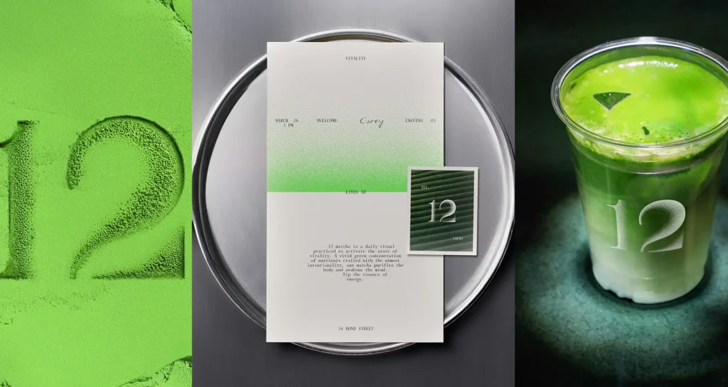
12 Matcha
One especially fascinating (and beautiful) presentation came from the agency BASE behind 12 Matcha, who shared that, very early in the branding process, they realized they had only one direction worth presenting to the client. The concept was so deeply informed by research, strategy, symbolism, and restraint that the identity barely changed from first-round presentation to final execution — something that, to an untrained designer, might almost go unnoticed. But that was the point. The confidence and clarity of the system was already there from day one. And now, seeing that same identity translated onto custom packaging for an upcoming matcha chocolate bar release (including that beautiful stippled gradient pattern — meow) felt like watching strategic conviction fully realized.
Nazionale by Auge Design
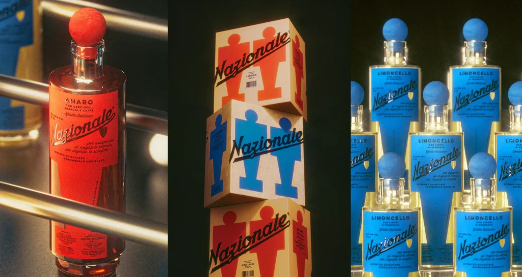
One fascinating takeaway from the conference was just how wide the spectrum can be for presenting a “version one” identity system. Some agencies intentionally show rougher concepts — low-resolution mockups, imperfect masking, and just enough ambiguity to invite interpretation. Others arrive with work that feels nearly production-ready. Miriam Frescura of Auge Design showcased stunning packaging concepts for Nazionale, including beautifully rendered custom liquor bottles complete with intricate print-inspired dot patterns and subtle stippled textures embossed onto the plastic cork featuring the proposed logo mark. The level of craft was almost disorienting in the best possible way. Less “here’s a direction” and more “here’s the future sitting on the shelf already.”
Granola by Ragged Edge
Granola, an AI-powered note-taking app, positions itself as the calm presence in the room — quietly capturing what matters so ambitious people can stay present and focused. Apparently, thousands of people criticized the rebrand online. And yet within months of launch, Granola had become one of the most downloaded productivity apps in tech and reached a $1.5 billion valuation. Design is subjective. What’s different gets noticed.
Football Brands With Immense Pressure
As a soccer parent, I was fascinated watching agencies PUPILA and ModestWorks® unpack the challenge of designing for deeply loyal football fans whose identity is tied to crest, city, and culture. The work for Fedefut Guatemala and Atlético Dallas was compelling enough that I genuinely considered buying jerseys for my son solely to support the craftsmanship.
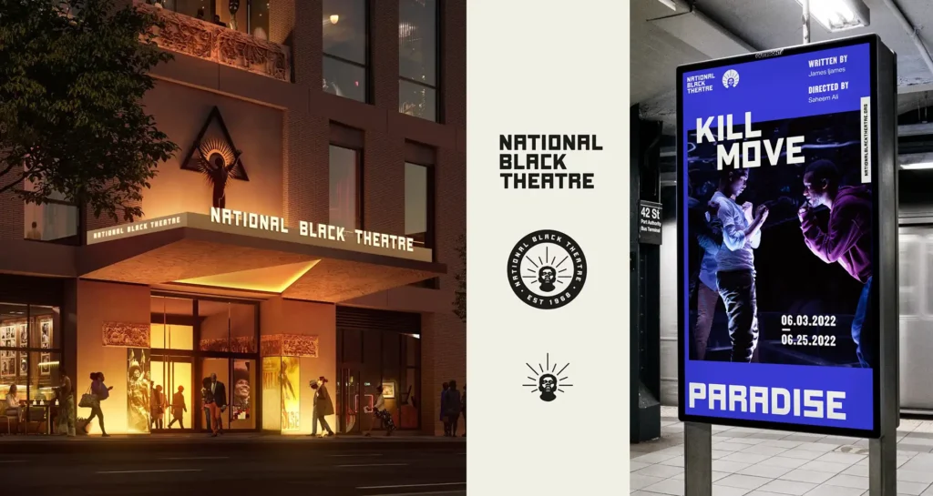
National Black Theater & Bal du Musée des Beaux-Arts de Montréal
Some identities carried such elegance and emotional intentionality that the room almost collectively paused. The visual identity for National Black Theatre by Isometric Studio, alongside Caserne’s branding for this year’s Bal du Musée des Beaux-Arts de Montréal (Montreal Museum of Fine Arts Ball), felt deeply intertwined with the spirit and mission of the organizations themselves. Both projects carried a level of care and cultural sensitivity that was palpable in the room. (And congrats to Montréal on the Friday night win over Buffalo.)
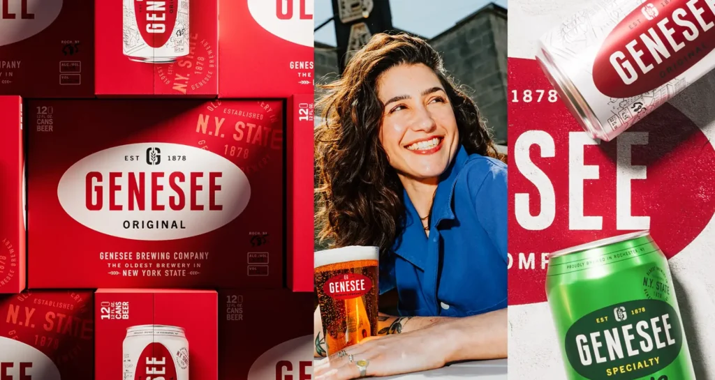
Genesee & Everything is Waves
One refreshing throughline across several presentations was how openly (and optimistically) agencies discussed iteration, client feedback, and reworking first-round concepts. The end results for Genesee by Sister Mary, based on data and field research, were stronger because of it. And Talia Cotton, of Cotton Design, takes the award for finding a truly novel way to Frankenstein (as we call it) 4 concepts into one.
Final Thought
We left the conference reminded that while our tools continue changing (at an almost absurd pace), the foundation of meaningful branding remains remarkably consistent.
Research. Positioning. Messaging. Taste. Conviction.
And the courage to make something opinionated enough that people actually feel something. AI may increasingly become part of our workflows. But after watching some of the best creative agencies in the world unpack the thinking behind their work for hours on end, one thing became very clear: The magic still comes from people.

Meet blog author Christina Melito,
Creative Director of Design + Digital
Read her bio here