W Energy
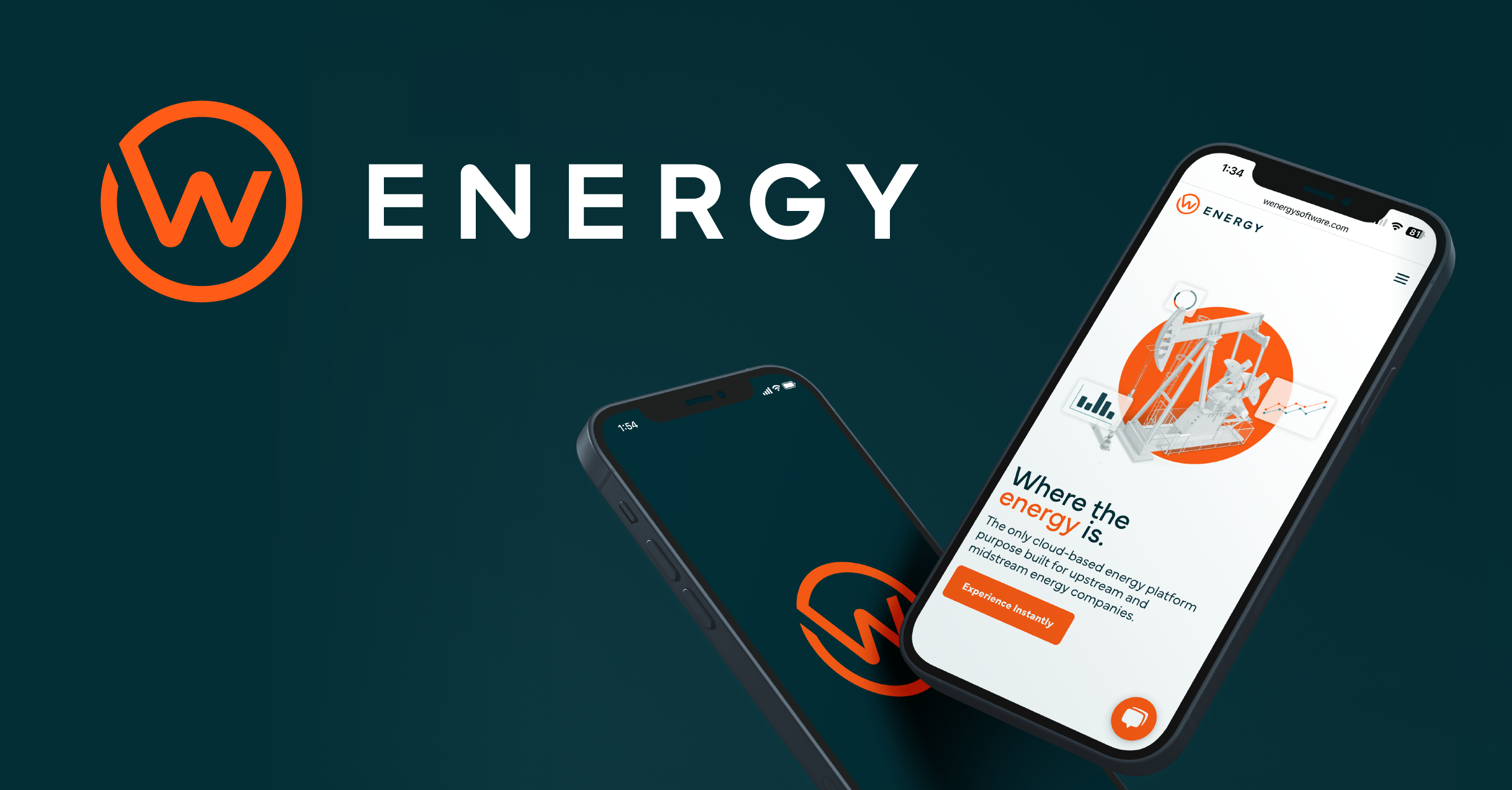
a rebranding revolution; transforming w energy into a platform leader
W Energy Software had an established reputation among customers as an effective provider of data-driven insights into energy companies, as well as back office services for everything from land acquisition to revenue management. But when W’s new CEO was tasked with reshaping and growing the company, she wanted to define the company as a platform-based software provider, not a services provider. That required rethinking the company’s brand, message, and website. That’s when they called us at Fifteen4.
Fifteen4 has extensive expertise rebranding companies who have recently been part of a merger or acquisition. We were known to W Energy Software after we renamed and rebranded Contruent following their acquisition by M33 Growth. Our plan was to evaluate W Energy Software’s name in consideration of a potential name change, create new brand messaging, redesign the brand identity, and create a new website. Every aspect of the branding would be informed by the new messaging we developed.
The Results
Fifteen4 helped the client achieve a 167% increase in site visits and a 120% growth in revenue. The team worked closely with the client and communicated via email, messaging apps, and online meetings. They also demonstrated creativity and high-level technical competency.
strategic messaging
The Fifteen4 team completed a multi-phase process to rebrand W Energy Software as simply, W Energy.
As part of that process, our team conducted extensive stakeholder interviews and completed a competitive analysis of the space. This led to the crafting of a new strategic messaging framework including brand narrative, taglines and positioning statement. This important work is completed so that it can inform our design of important visual assets that help to tell the brand’s new story: logo design, color ways, and typography. As the messaging and design work nears completion, we set about the work of designing and building a new website.
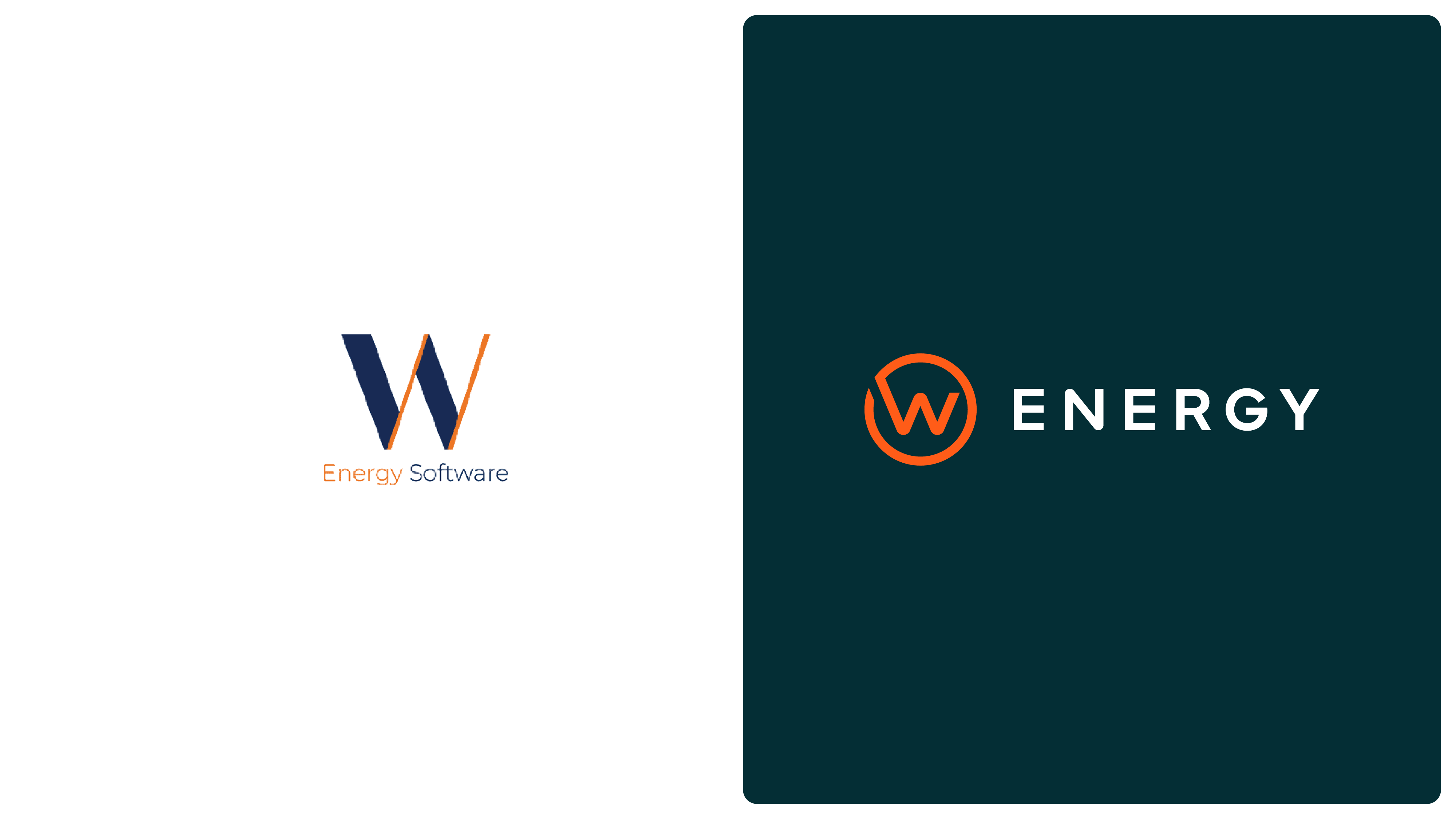
brand identity
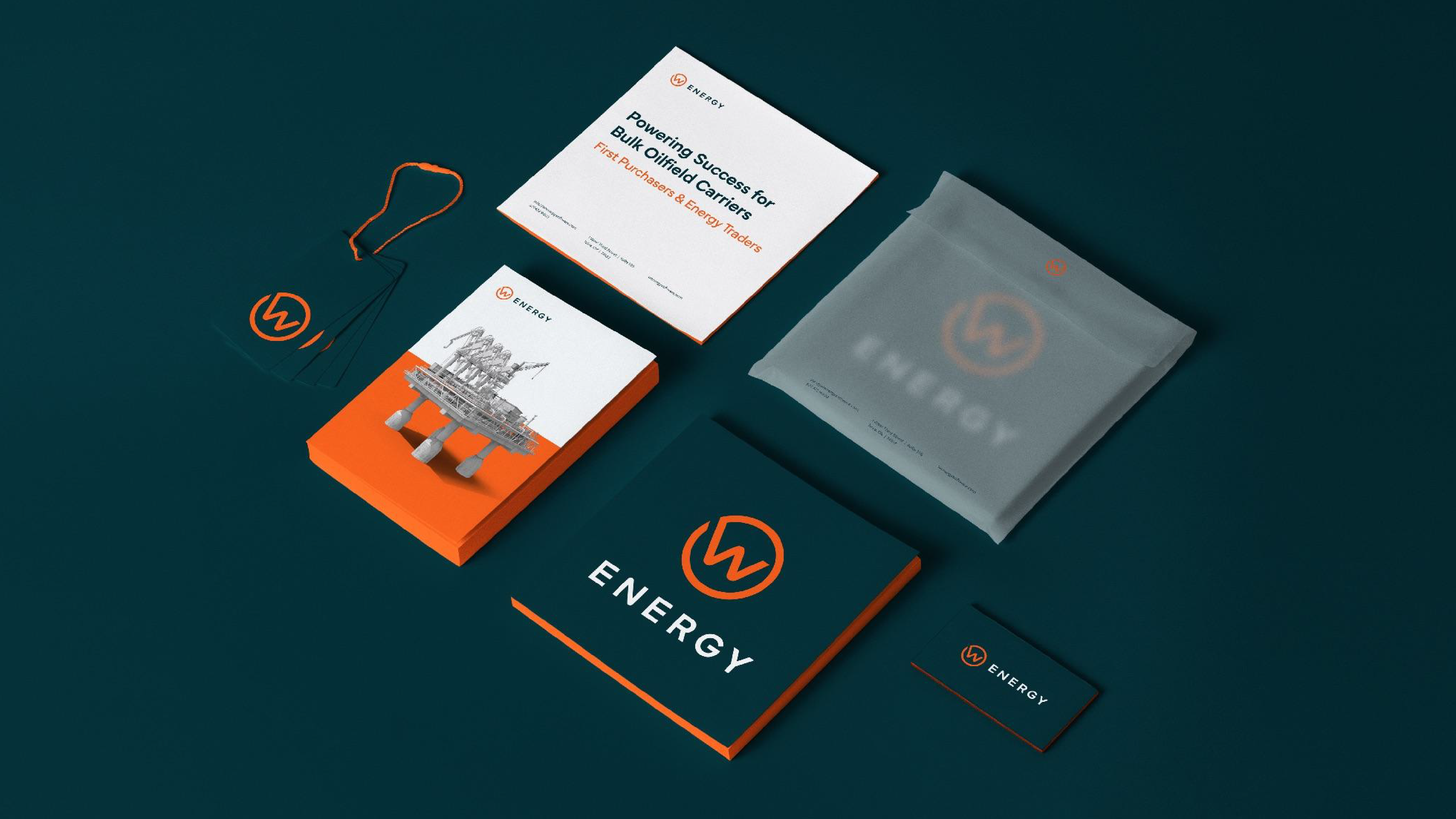
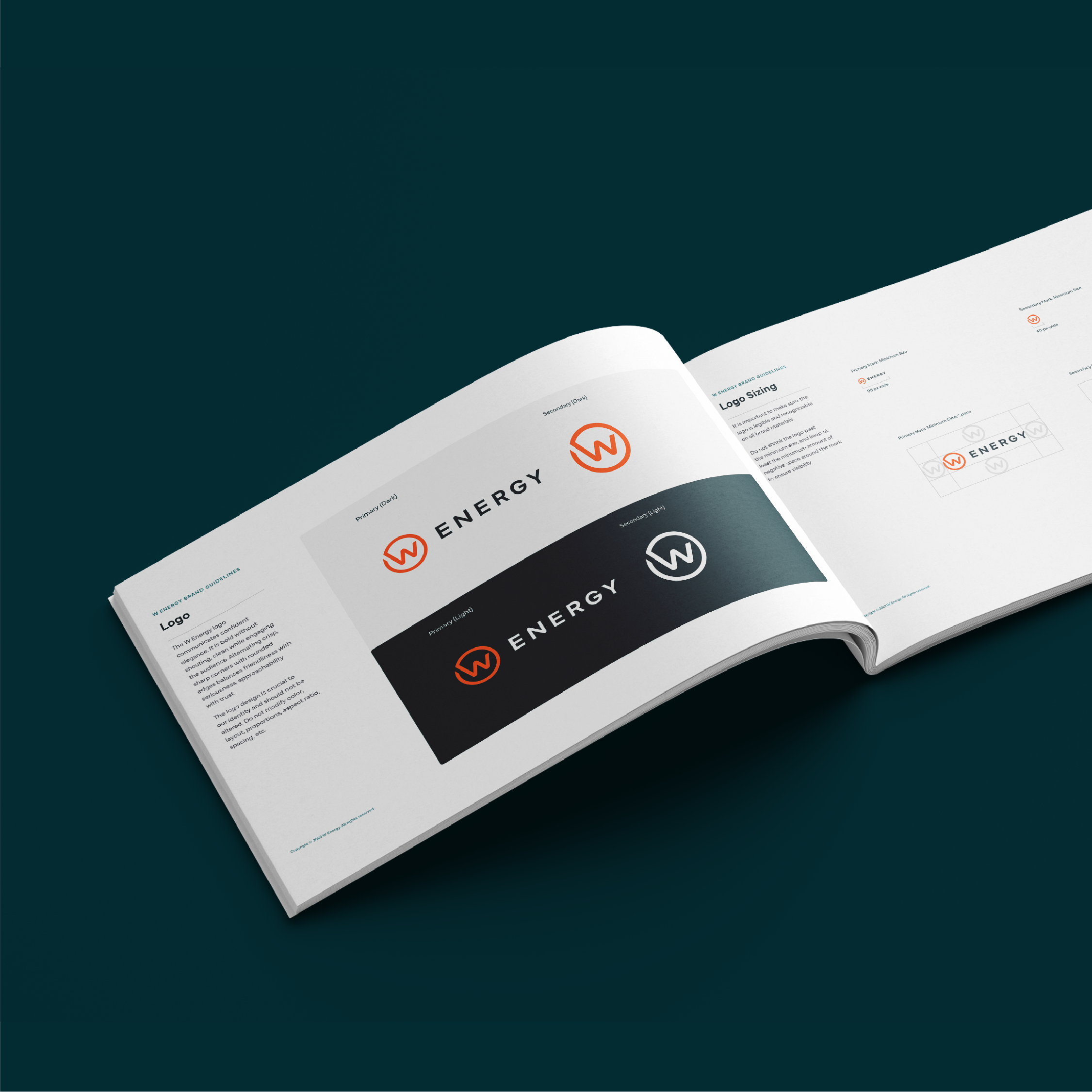
As our design team begins its concept work, careful consideration is given to the personality of the company: its core values, priorities, and the traits that define the way they work. We also believe it’s important to pay attention to some basic design principles that define the industry our client is working within. Why is this important? Because making an energy company look like a sports apparel brand doesn’t help them achieve leadership among their peers.
who doesn’t love a challenge?
W Energy, while maintaining leadership with current oil and gas energy customers, also wanted a brand that would translate well as the industry begins its move into more renewable energy sources. Their technology platform serves energy clients no matter what kind of units they’re moving. The future involves not just gallons of oil, liters of gasoline and cubit feet of natural gas, but kilowatts generated by solar and wind as well. The brand we designed had to be elastic enough to meet these future challenges.
website design + development
The Fifteen4 team worked closely with W Energy’s internal designer to craft the stylistic approach of the website’s homepage so that we could collaborate effectively on interior page designs. Our team created several distinctly different stylistic directions, shown below, that would help establish how exactly we apply the new brand elements to a web context before ultimately landing on what is now, our final product.
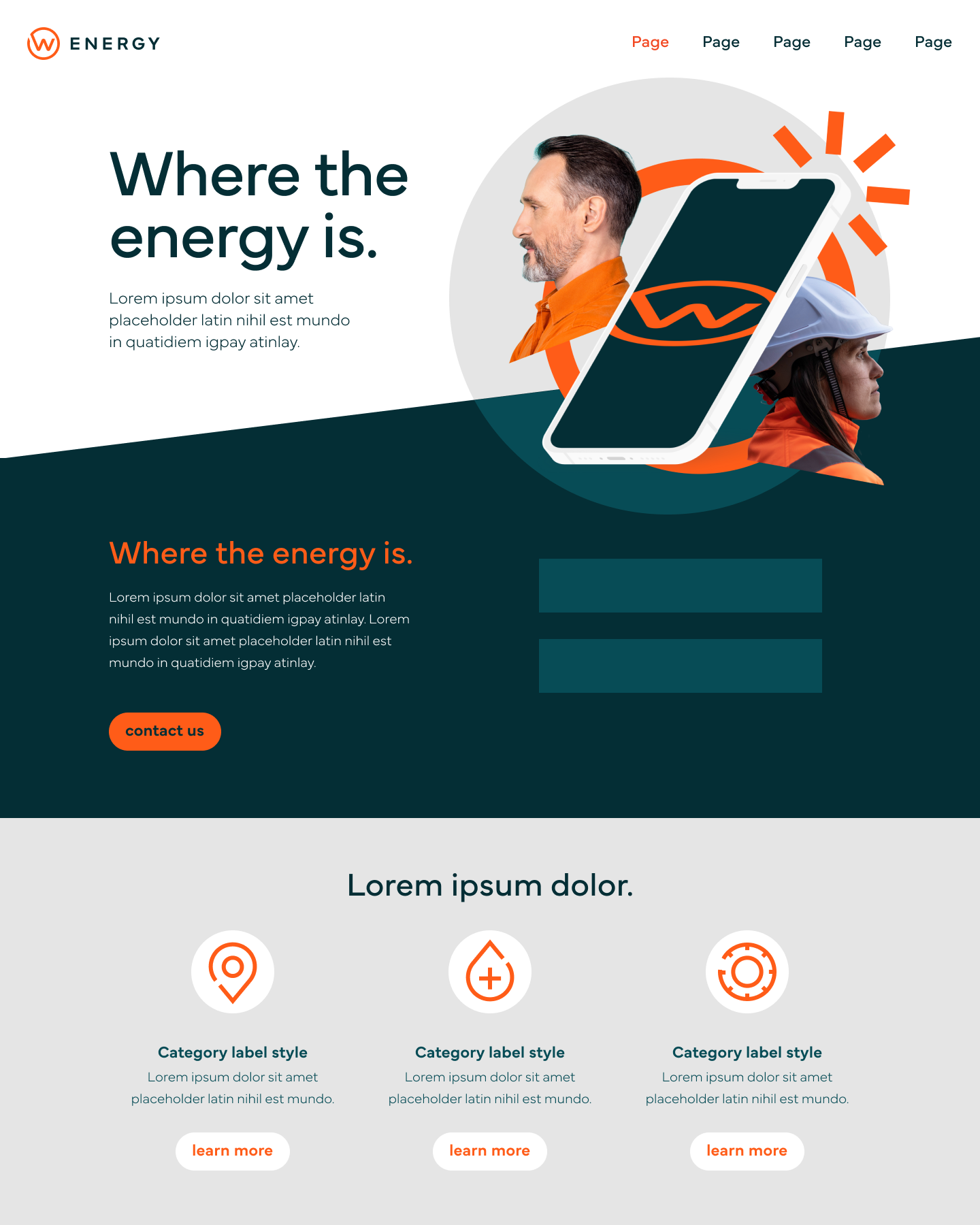
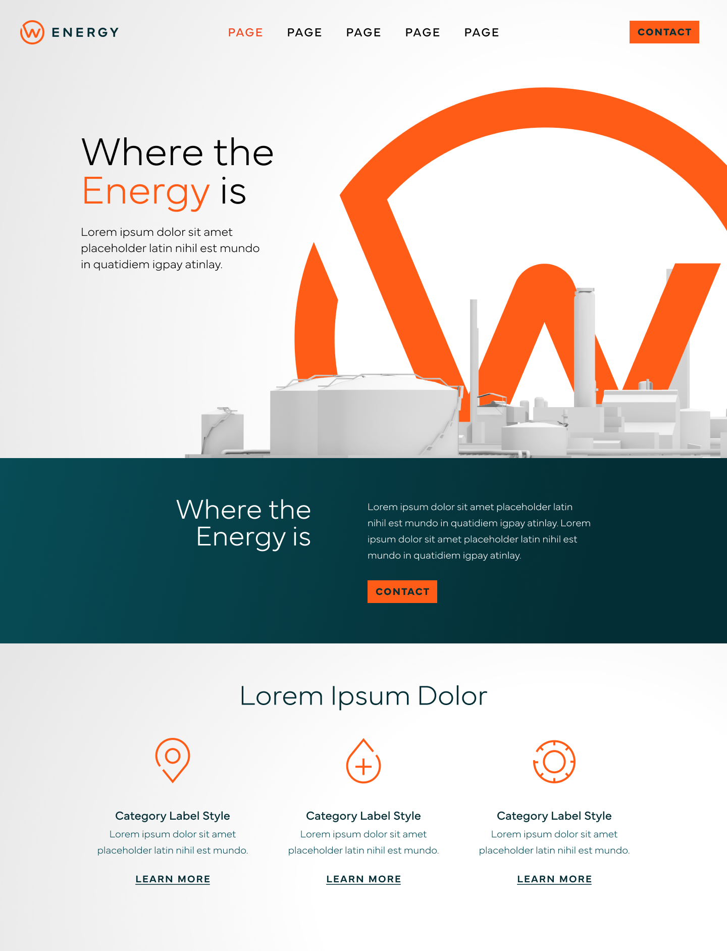
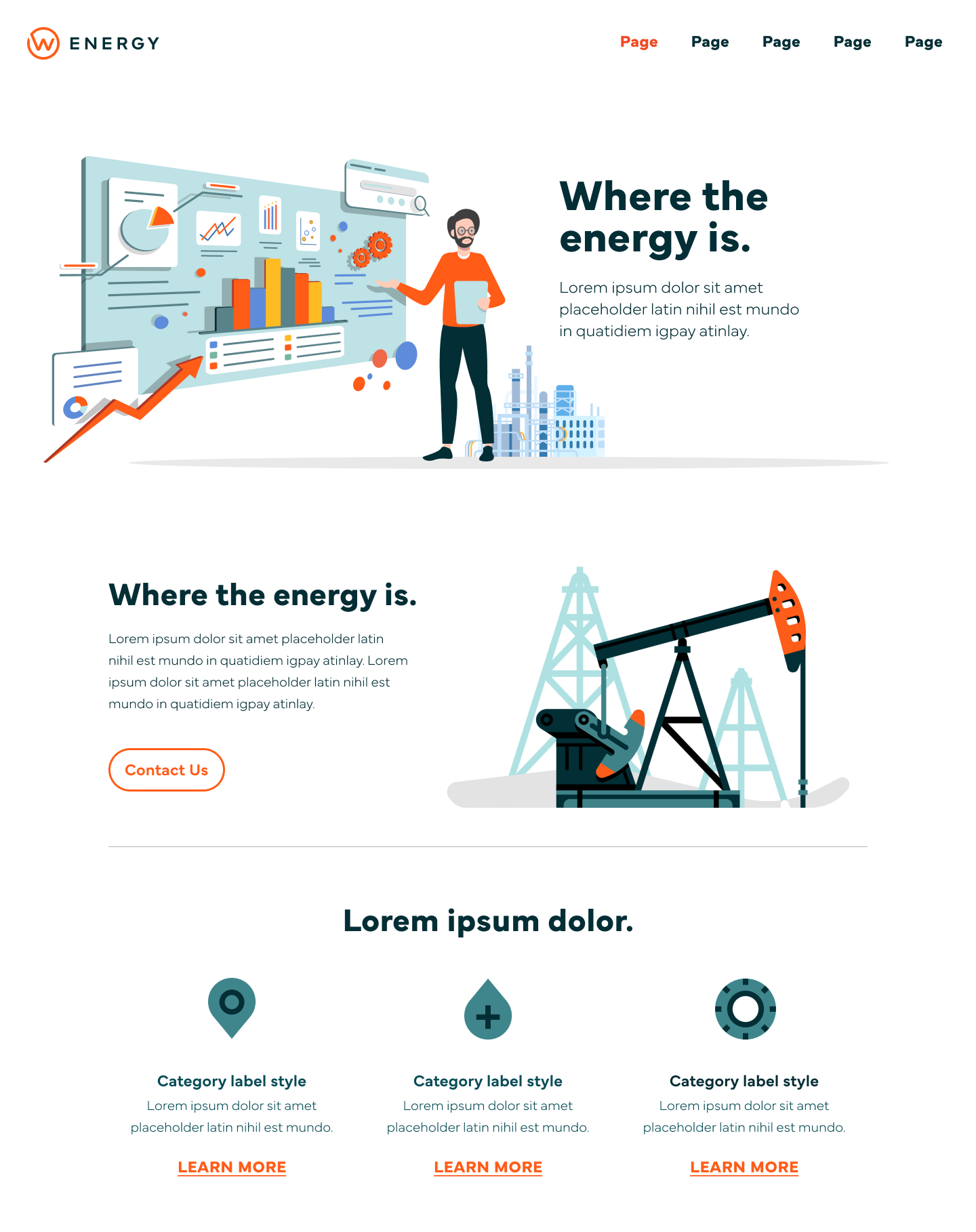
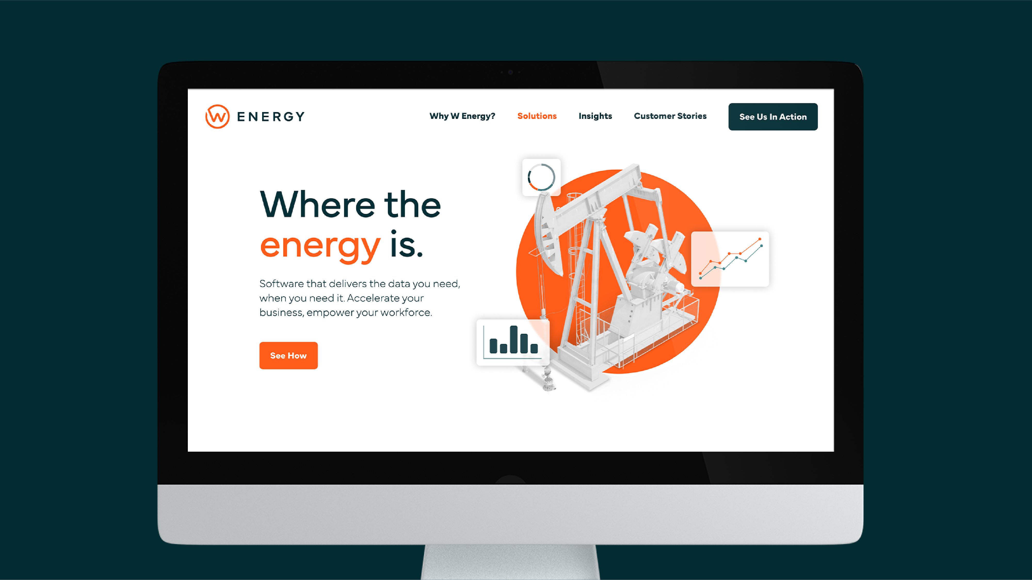
Fifteen4 successfully rebranded W Energy, positioning it for rapid growth and expansion of their brand into new markets. The new website features an intuitive user interface and a clean design that places W Energy’s core brand message front and center.
services
brand messaging, visual identity, web design, web development

