LeapPoint
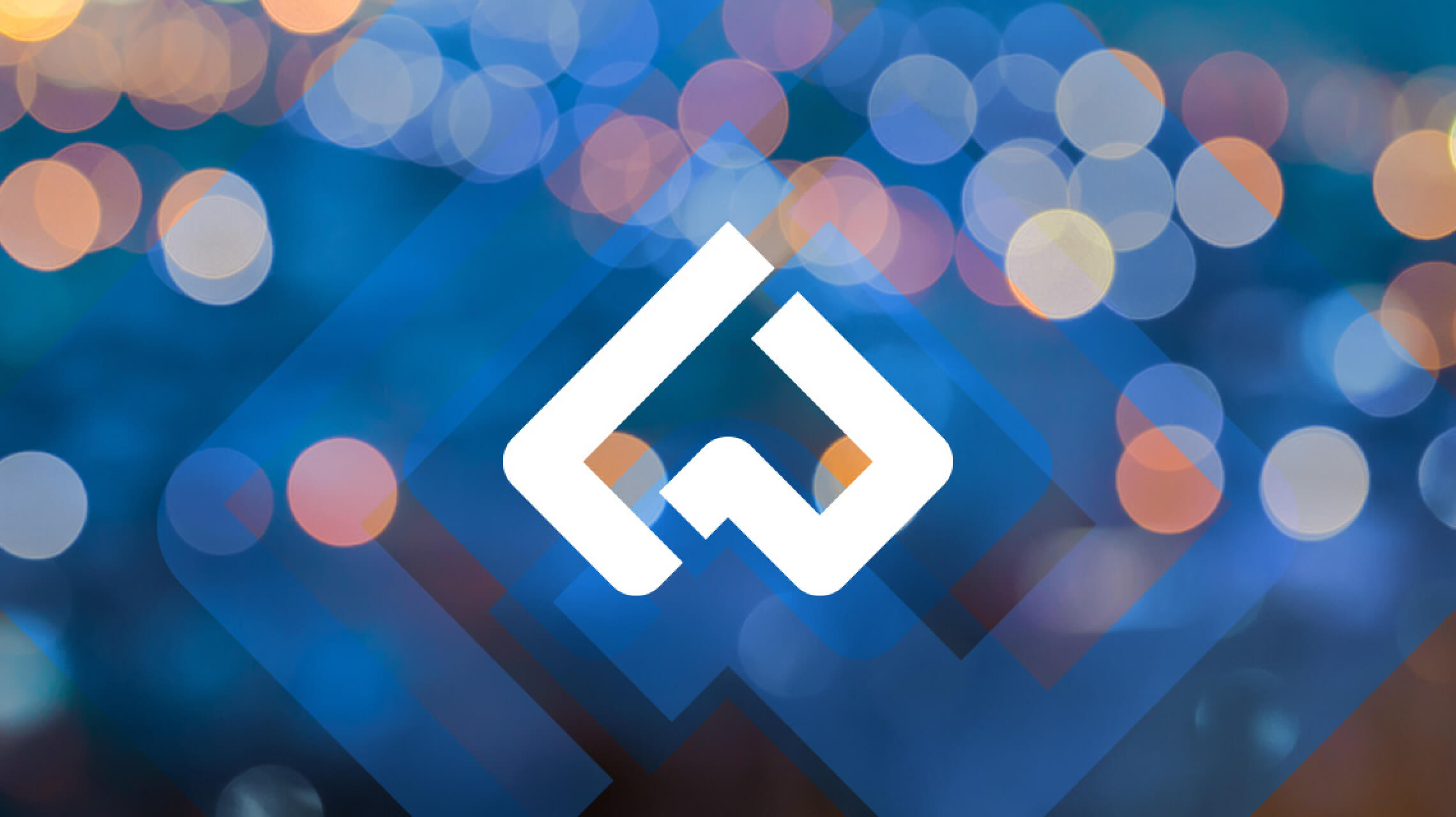
Repositioning a leading technology integration partner
Over the last 15 years, they’ve built considerable customer loyalty and industry recognition. So it was time for them to level-up their brand identity to make it portable and durable enough for the next level of growth.
In addition to helping their leadership discover their real WHY for their business model and solution, Fifteen4 led them into a deeper design language for their brand identity and message. The goal: achieve recognition beyond their logo and arrive at a modern approach that is more relevant and forward-thinking.
VISUALIZING THE LEAP: INITIAL CONCEPTS
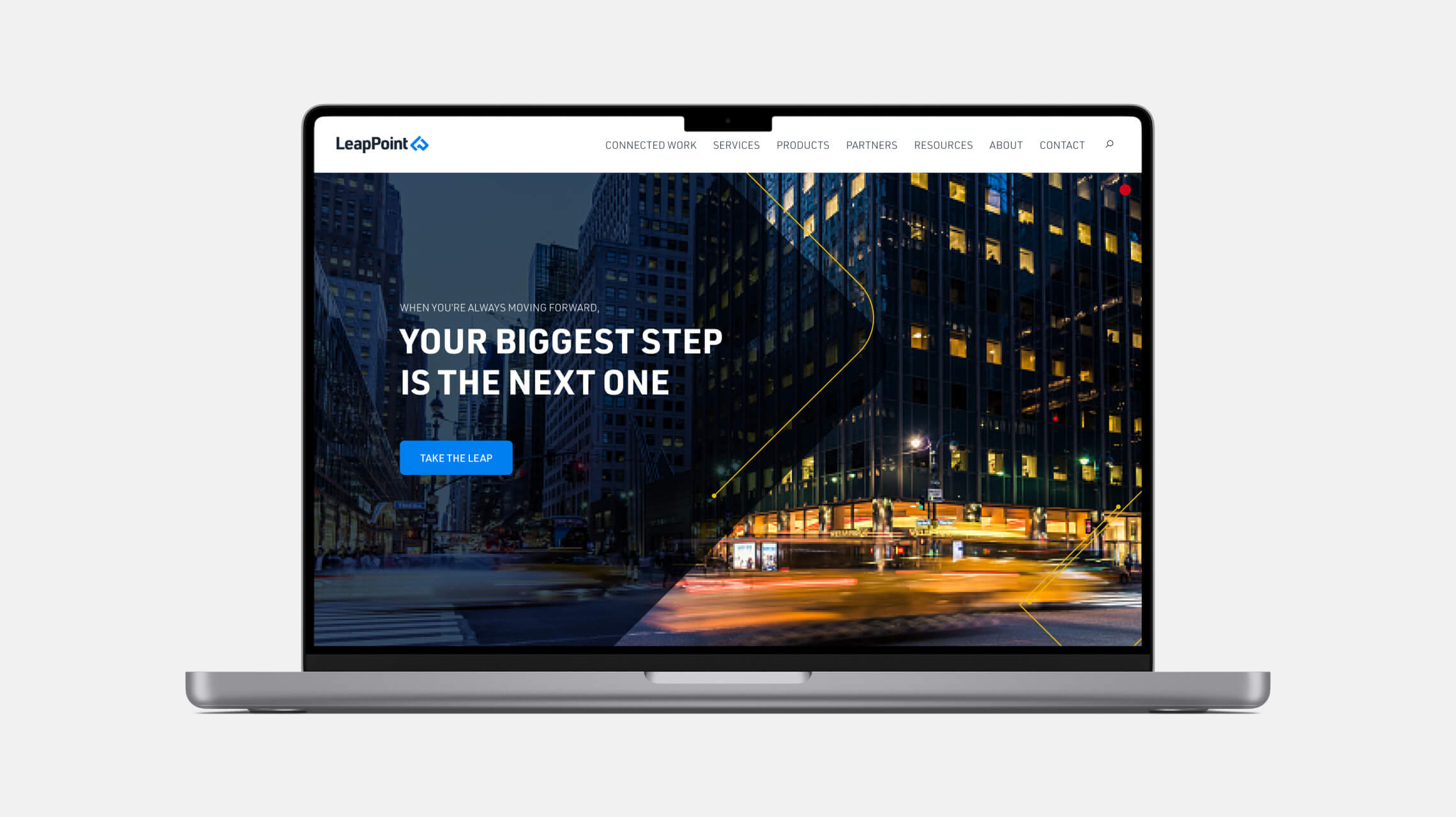
Linear elements based on the logo become a way-finding system, connecting content and visually demonstrating how LeapPoint helps customers find their way in the modern age of technology. The brighter palette is more modern and helps distinguish LeapPoint from competitors.
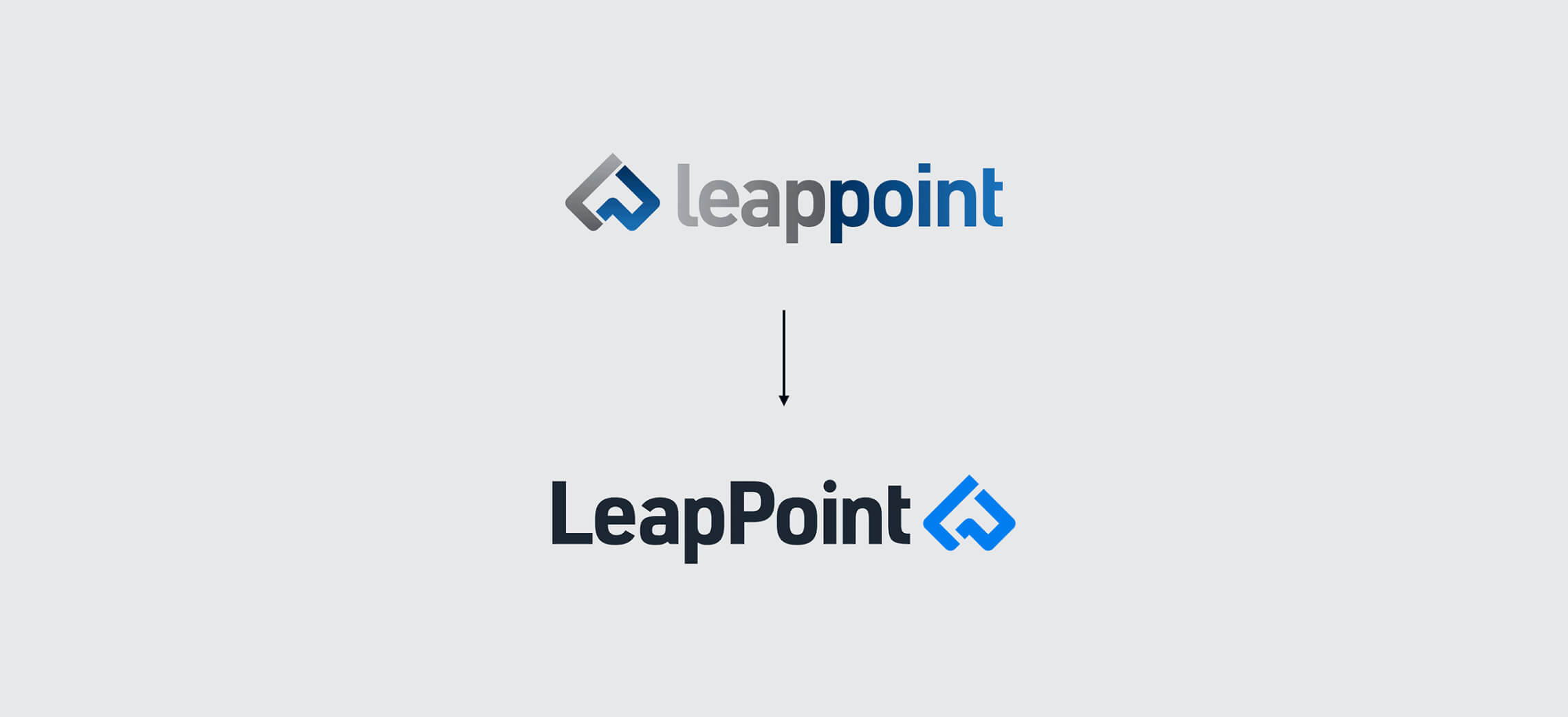
logo evolution
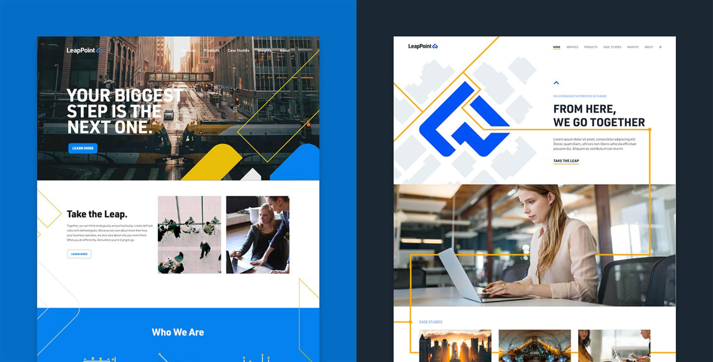
Web site design + development
We started the web process with a content audit and proposed new user flows via the information architecture. Once the new branding was in a “feel-good” place, we went to work on applying that design language to a whole new web experience. The brand identity evolved alongside the web work.
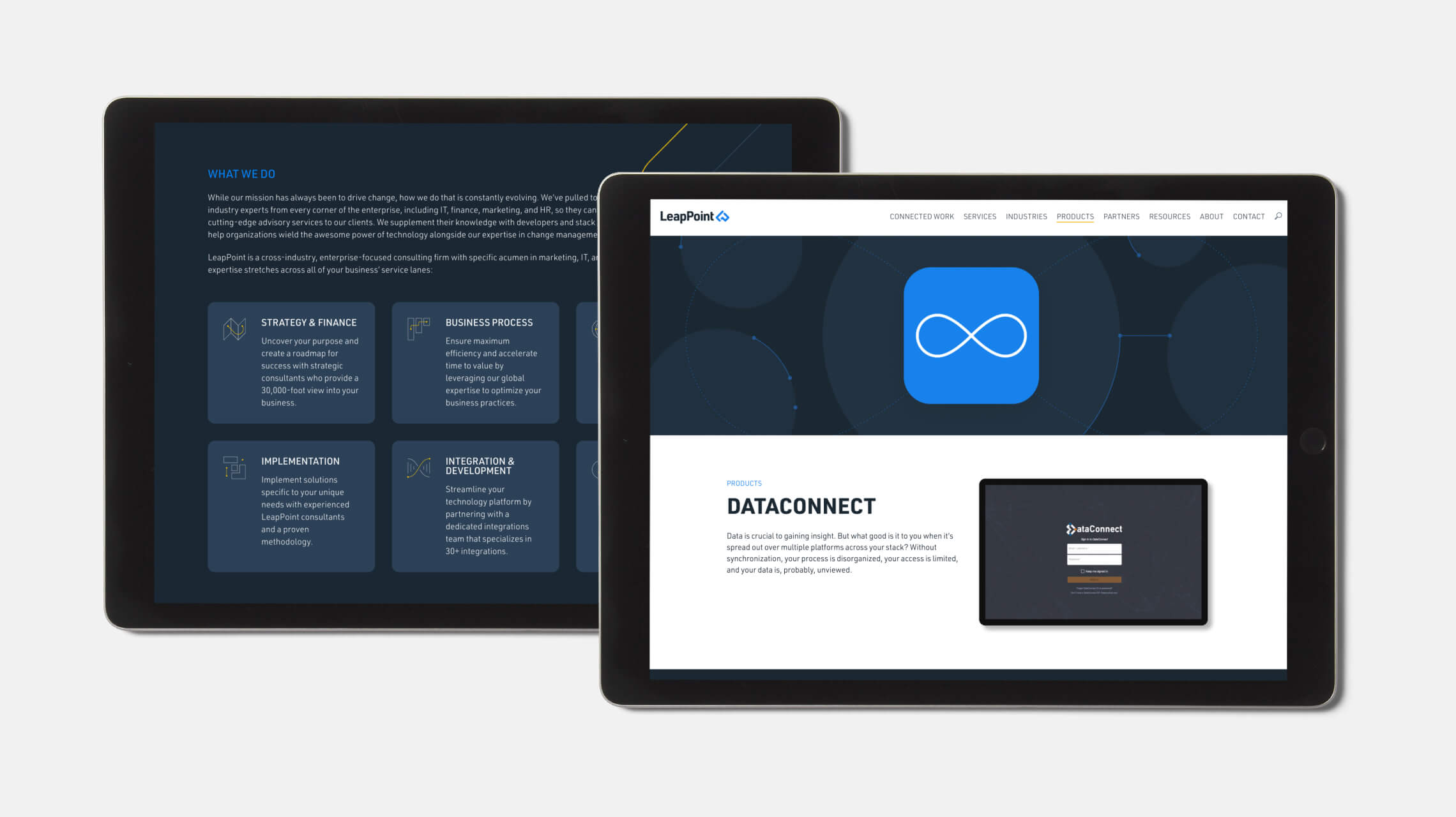
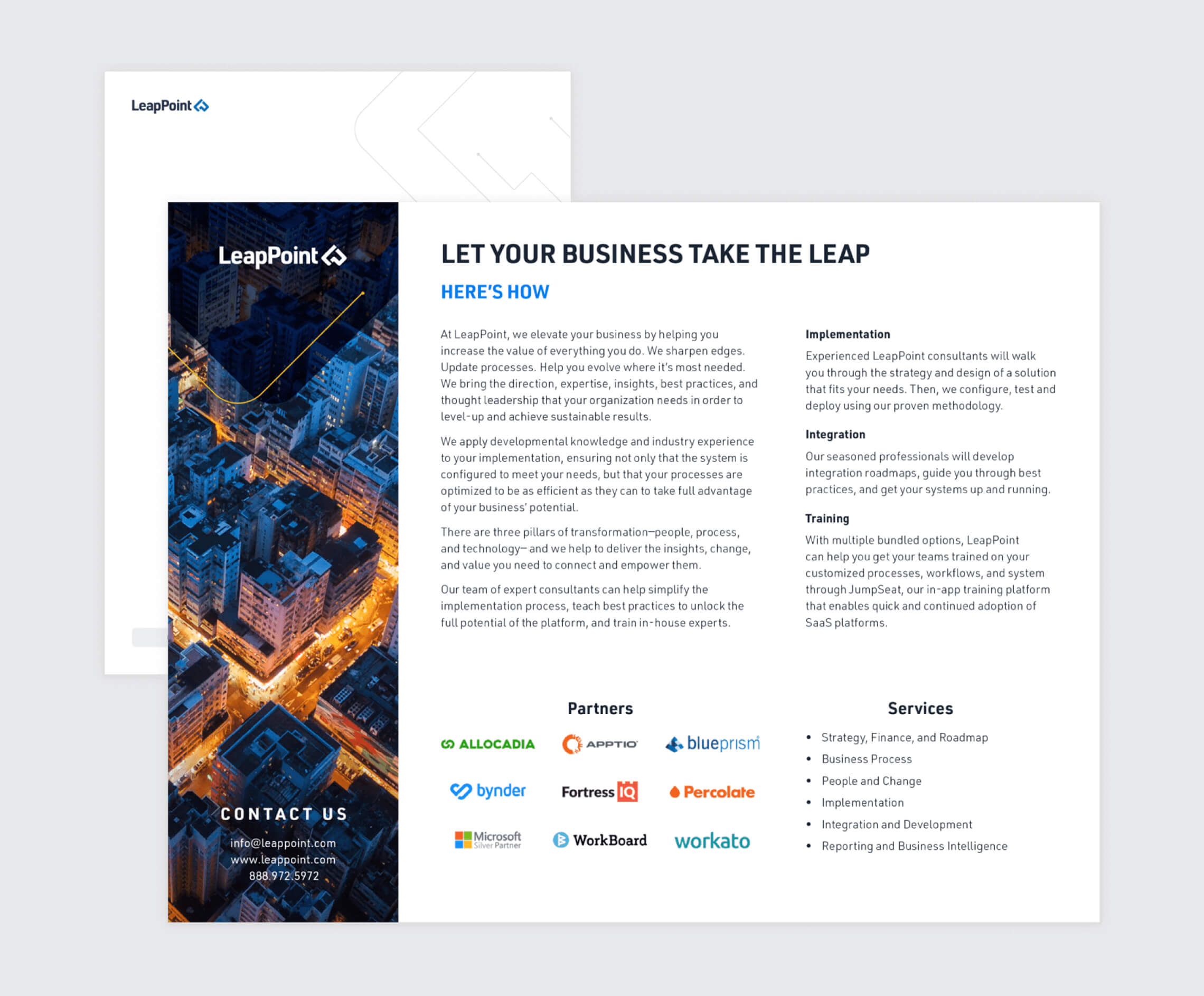
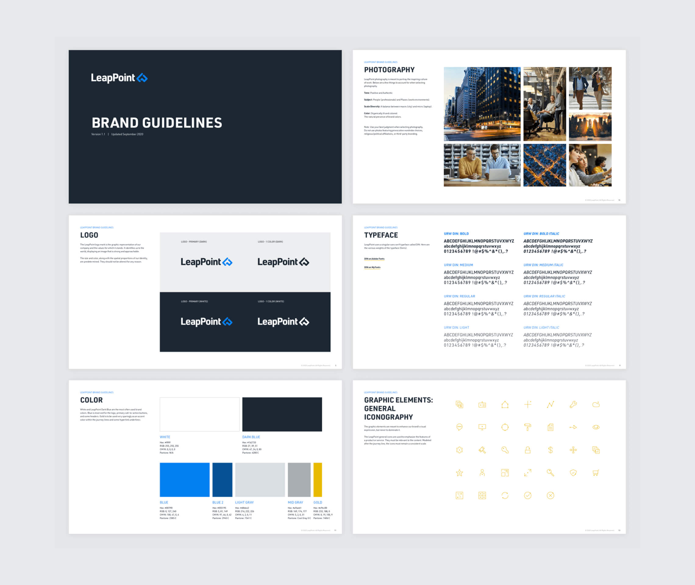
Collateral + brand guidelines
