
Matt DeVille, VP of Digital, meditates on the nature of grid systems in design.
If you’ve ever driven in a city that’s neatly divided into quadrants and subdivided by an orderly arrangement of streets that adhere to the four cardinal points, you’ve experienced the power of the grid. Of course, even cities that were planned around this system can be punctuated by elements like traffic circles or divided by diagonals that add a little variety to the experience (think Washington, D.C.). Those elements can be exciting or frustrating, depending on how well you know the city.
The concept of the grid is as old as geometry itself, and while I won’t pretend to be a mathematical scholar, I believe that the grid has had an incredible impact on design, both analog and digital.
While the web originated as a heavily text-oriented medium with some support for visual elements, users today expect a highly visual, rigorously designed experience.
Additionally, with the advent of smartphones and tablets, web designers were forced to drop fixed-width designs. Many developers sought a more systematic approach to layout — to ensure compatibility, but also to maintain their own sanity. The days of arbitrarily assigning proportions to sections of a page came to an abrupt end. While many developers sought to build their own grid systems in code, Twitter released Bootstrap as an open source solution. Several grid frameworks followed and today we rarely think of designing a site without basing the design on a twelve column grid.
A Very Brief History of the Grid in Graphic Design
Grids have been a part of human experience since the advent of writing, if not earlier. Scribes would line their documents to provide visual guides for orderly composition. Later, with the birth of the printing press, blocks of text were set using tiny blocks of type – letter by letter. How was everything kept neat and orderly? The grid.
In 1919, an art school was formed in Germany called Bauhaus (“School of Building”), which set forth to create a holistic practice.
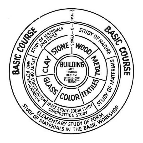
The Bauhaus model of teaching was based on this diagram, developed by Walter Gropius in 1922. Although there is no direct correlation here to the concept of the grid, there certainly is an orderly system in place.
The Bauhaus is often credited with emphasizing the importance of both theory and practice in design and is sometimes referred to as the birthplace of graphic design.
Later, Josef Müller Brockmann (who was deeply influenced by the theories espoused at the Bauhaus) took up the charge and wrote extensively on the importance of the grid for graphic design. His statements1 often go beyond just advocating for a systematization of design — an insistence on objectivity — stating that the designer’s calling has a higher purpose:
“The use of the grid as an ordering system is the expression of a certain mental attitude inasmuch as it shows that the designer conceives his work in terms that are constructive and oriented to the future.”
At the same time, he can be very practical:
“The grid system is an aid, not a guarantee. It permits a number of possible uses and each designer can look for a solution appropriate to his personal style. But one must learn how to use the grid; it is an art that requires practice.”
So, What is a Grid?
Grids always have columns — sometimes they have rows (typically called the baseline grid). Grids have margins and gutters. Gutters are the spaces between columns. Grids can be measured in pixels, percentages, picas or inches. They can even be measured in millimeters, if that’s your thing.
- Graph paper is a kind of grid.
- Maps use grids: the grid is expressed via longitude and latitude.
- A spreadsheet is a grid. A super-nerdy kind of grid.
Items, whether blocks of text, images, pull quotes, virtually any form of content, are arranged on the grid.
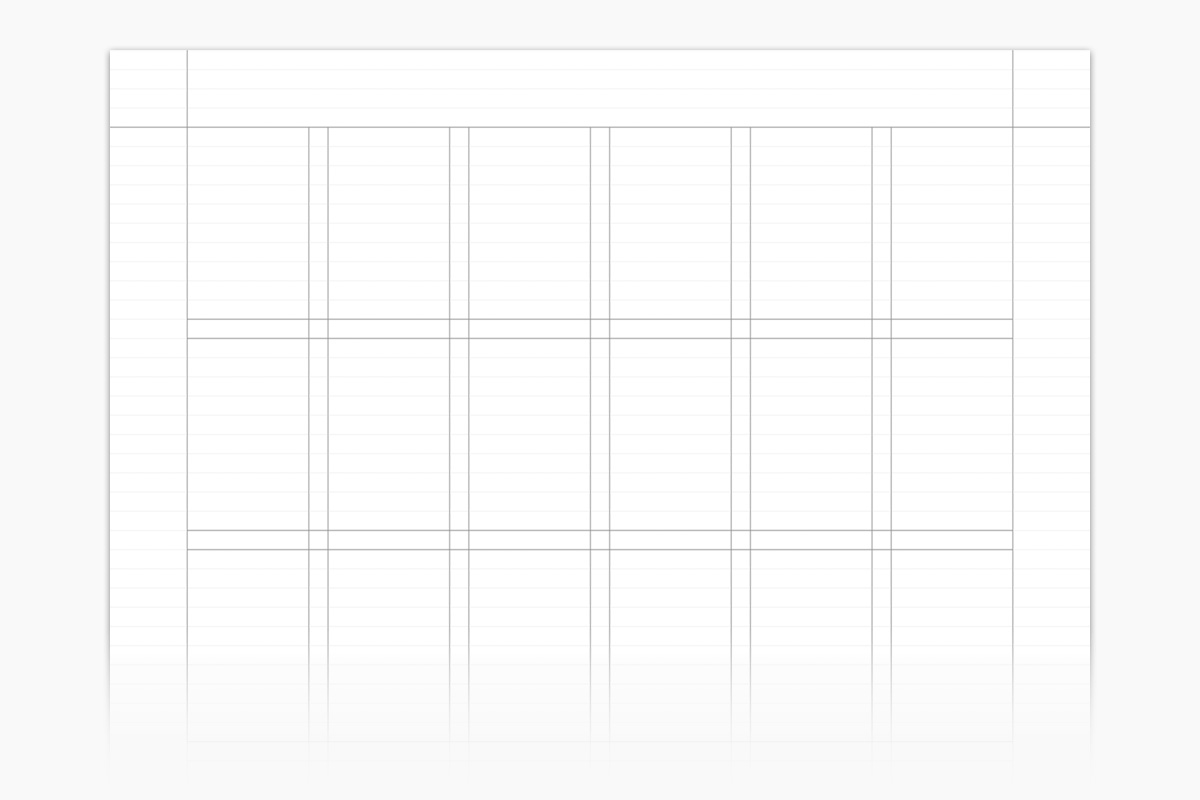
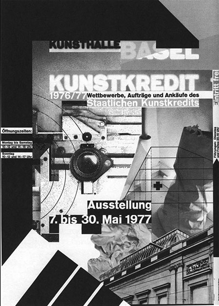
A grid can look like this:
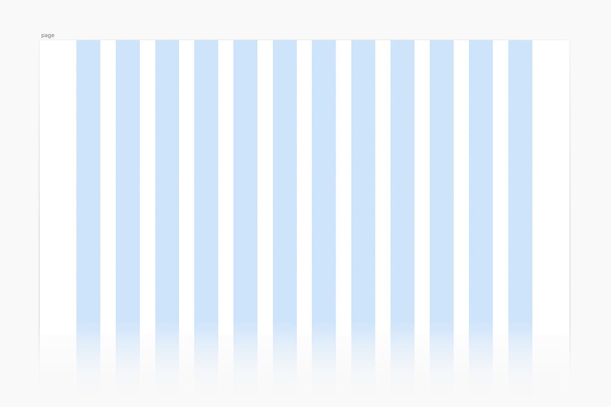
It can also look like this:
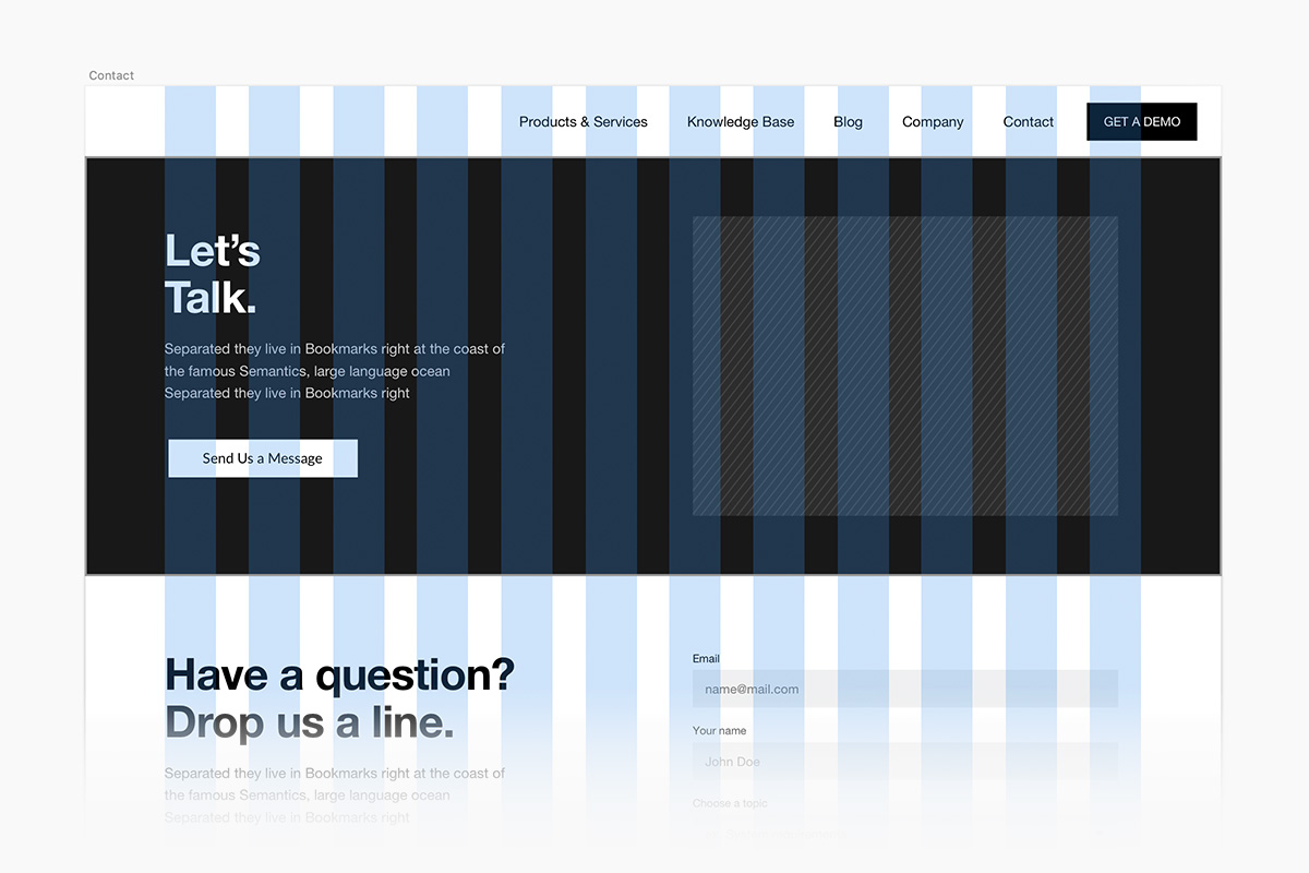
A website grid with basic content blocks applied looks like this:
Why Grids Matter
Simply put, grids bring a sense of order. Adhering to a grid helps the designer make decisions. At the same time, if the grid in place has been poorly conceived, it can feel like a prison. If the gutters of a grid are too narrow, for example, the whitespace between columns of text can make reading the text more difficult.
As with any system, respecting the grid too strictly leads to monotony. That is why designers often find ways to break the grid.
Even Massimo Vignelli, who insisted on discipline in design, stated this:
“Don’t be governed by the grid, govern the grid. A grid is like a lion cage – if the trainer stays too long it gets eaten up. You have to know when to leave the cage – you have to know when to leave the grid.”
Breaking the Grid
When we leave the cage, we often call it breaking the grid. Some designs go so far that we call them “broken grid” designs.
Simple ways to break a grid include:
Allowing text to overlay imagery, spilling out of its container.

Overlapping visual elements such as blocks of color, photography, video, etc.

Bureau for Visual Affairs overlaps visual elements to create a sense of depth without relying on drop shadows.

As you scroll, elements that peak out from behind other elements are revealed, creating a very rich experience.
Placing elements with so much spacing between them that the grid is harder to discern:
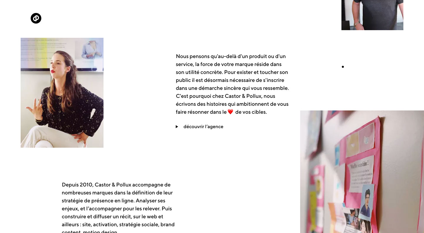
Castor Et Pollux presents content in a very open, loose feeling grid.
Removing the gutters from one section to the next and/or interspersing full-width sections between sections that rely heavily on columns, to create a visual rhythm:

Breaking the grid often lends an element of uncertainty, which can make a design feel more interesting. Taken too far, it can lead to chaos.
Does Every Design Need a Grid?
No, not necessarily. And certainly, not all designers have been fans of the grid.
Wolfgang Weingart, Swiss designer and leader of the “New Wave/Punk Typography” school of thought, rebelled against the grid in favor of a more expressive mode of design:
In the nineties, designers ignored the grid, to great expressive effect. David Carson got famous for doing so. His work was admired by some and derided by many. He was also a former surfer, which may have contributed — in a negative fashion — to the reception he got from academics. Having been a skateboarder myself who became a designer because I admired the work of Carson and others whom I perceived as avant-garde at the time, I always thought the negative reactions were short-sighted.

When asked about Carson, Müller Brockmann replied, “I don’t surf, I dive.”
All manner of visual design can benefit from a grid. Designs that are created without a sense of order are easily spotted, even by a non-designer. Irregularities like uneven margins, a lack of visual hierarchy, and a general messiness are the first clues.
While not all designs require a grid, a grid always provides structure and a rigidity to push against. We often talk about the tension created by constraints placed upon design. The grid is a self-imposed constraint that every designer should respect.
The grid has helped all of us organize our thoughts — for centuries. Right now, you’re likely reading from a screen which is made up of pixels (yet another grid), with four sides. Those boundaries help you focus your thinking. Additionally, we designed this page using a grid which constrains the copy of this article to a width that is conducive to reading. Whether grids are overtly apparent in our experience, whether we are conscious of them or not, grids shape our lives.
1. Grid Systems in Graphic Design/Raster Systeme Fur Die Visuele Gestaltung ↩