“We want to refresh our logo, but we don’t want a whole new logo.”
Translation: We want a new logo, but we don’t want to pay for it.
Clients don’t know how to talk about redesigning their logos. They want better, but they don’t like change. Or they simply don’t know how to describe the level of change they want. That’s understandable.
Just to get us all on the same page, this is how I like to describe the various levels of logo redesign.
1: Logo Refresh – Clean up your house
This means minor modifications to achieve the goal of making the mark feel new (more modern, youthful, approachable, etc.). Modifications might include adjusting scale, alignment, color, and footprint.
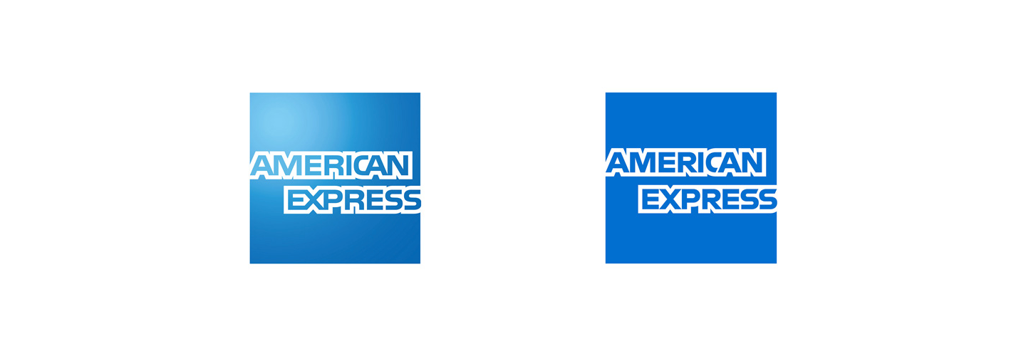
American Express dropped their gradient treatment and made modifications to the typography.
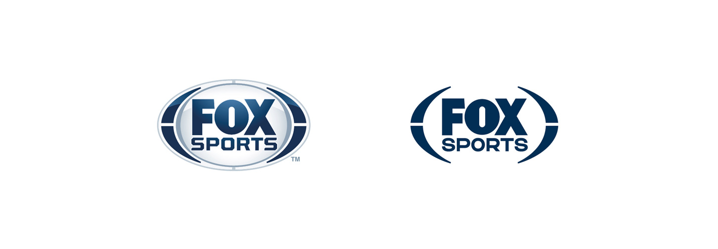
Fox Sports removed the 3-dimensional styling of the original in favor of a flatter, simpler aesthetic.
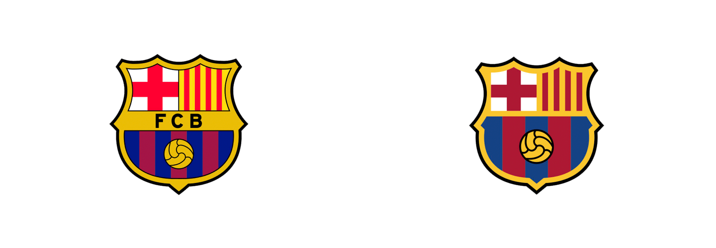
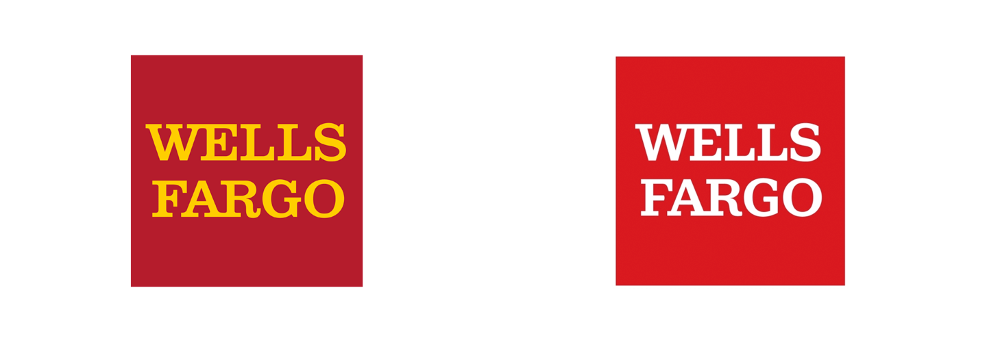
FCB kept all the major elements in place, while making some major simplifications in linework. They also removed their name from the logo.
Goodbye yellow, hello new typeface!
2: Logo Evolution – Remodel your house
This means more noticeable modifications to the mark without tearing down the equity built up by the original logo. Modifications might include a new typeface or redrawn symbols.
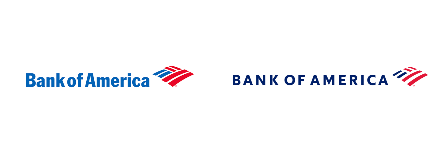
Here we see a shift to all-caps and a modified flag/landscape icon which incorporates more whitespace.
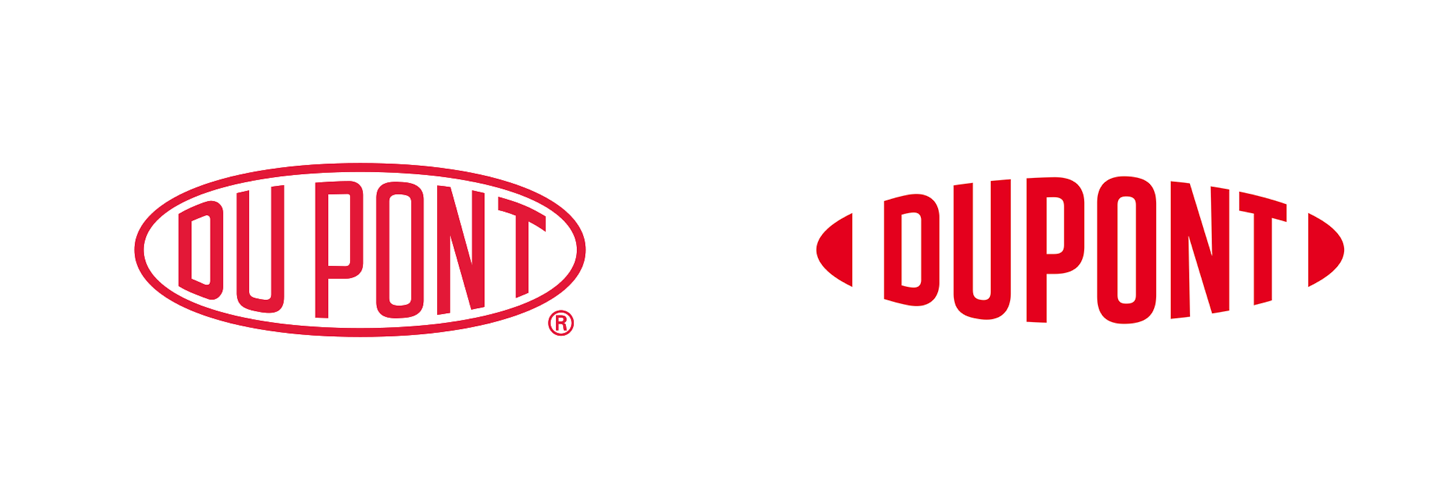
DuPont made their typeface bolder and move from using a stroke to encapsulate the name to using shapes before and after to imply an oval shape.
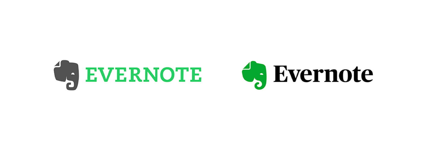
The elephant has been softened and the typeface has been changed to a classy serif from a slab-serif! Note the tweaks to the color palette as well.
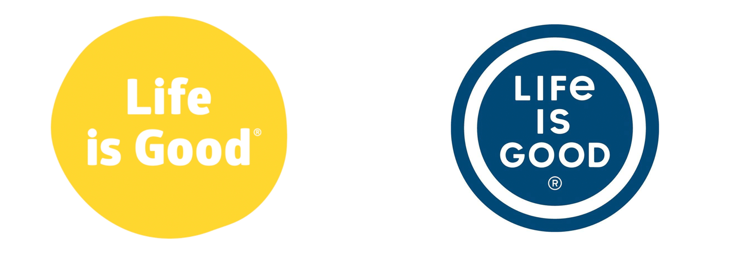
Life is Good transformed their mark from an amorphous, hand-drawn feeling to a clean, perfect circle. Note how the typography’s circular letterforms echo the perfect circle.
3: Logo Redesign – Buy a new house
The current logo has served you well over the years, but now it’s time to move on. We are building you a whole new logo from scratch, as if you started the company today. We may include some nod back to the previous branding, but this is the dawn of a new day.
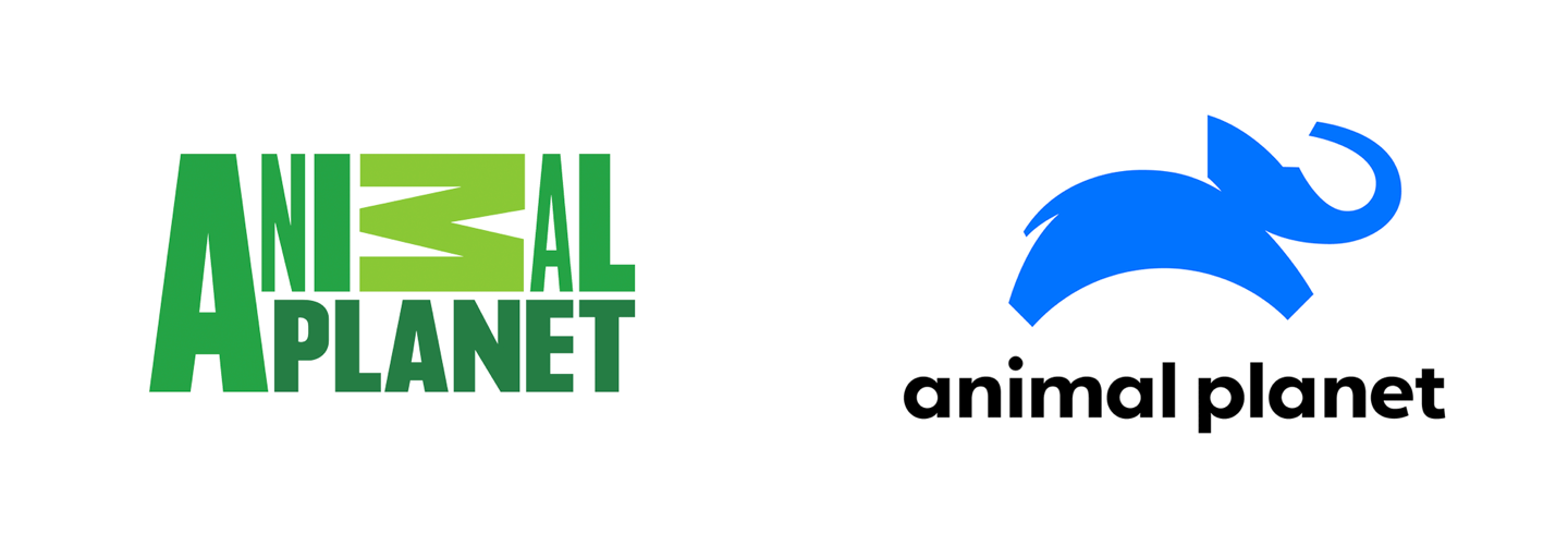
Gee, it’s hard to say what changed here… JK, pretty much everything has changed!
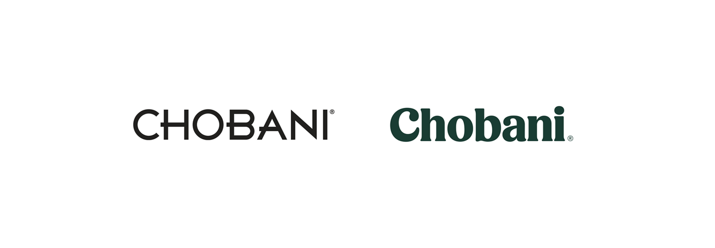
Chobani moved from a highly geometric typeface to a luxurious font that echoes the sumptuousness of their yogurt.
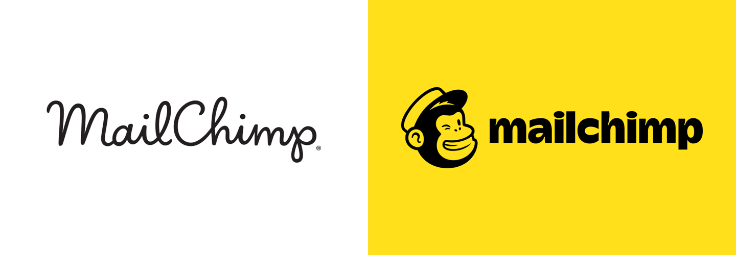
MailChimp introduced a character to reinforce its name.
Before you embark on this logo-hunting journey, ask yourself these questions:
- What is wrong with your current logo?
- What do you hope to achieve with a logo redesign?
- Why is the timing right?
Happy house hunting!
Disclaimer: We can design (or redesign) logos in a vacuum, but we highly recommend taking a broader look at your brand identity to see how any change to the logo will impact other visual elements. See our post – Design 101: What is a Brand Identity?