
Matt DeVille, VP of Digital, talks about UX best practices for blogs.
Blogging. What a wonderful word. Nowadays, we take blogging for granted, but many of us can remember the pre-blog days of the web. Blogging helped democratize the web, and while many blogs are just adding to the noise, others are incredibly helpful. Need to understand how to build a chicken coop? There are zillions of blogs about that very subject. Want to figure out how to clear your network cache on MacOS? The answer will likely be found on a blog.
Whether you’re a blogger blogging about your obsession with tiny food or an enterprise using blogging to help keep your customers well-informed, there are several simple, no nonsense things you can do to make your blog great.
1. Make Your Blog Highly Visual
Invest in captivating images for each post. Ensure that the imagery is meaningful and tailored to the content of the blog post. Why? Engaging visuals grab the user’s attention.
Featured content deserves large, immersive imagery that sets a standard for visual hierarchy.
[grid additional_classes=”u-margin-top–extinct u-margin-bottom–small”]
[grid_column initial_width=”6″ md_width=”6″ lg_width=”6″ width=”6″ additional_classes=”o-scroll-animation o-scroll-animation–fade-up js-scroll-animation”]
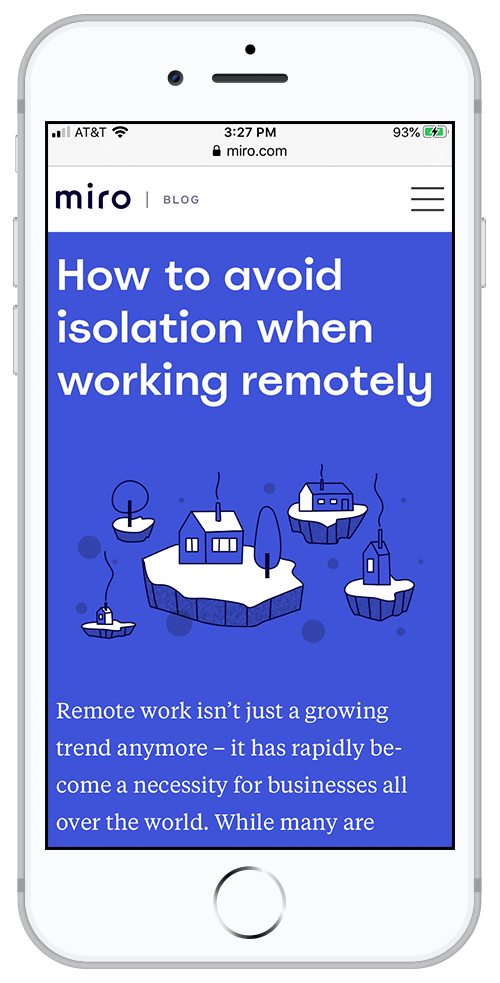
Miro employees whimsical, custom illustrations and bold colors to liven up their blog posts.
[/grid_column]
[grid_column initial_width=”6″ md_width=”6″ lg_width=”6″ width=”6″ additional_classes=”o-scroll-animation o-scroll-animation–fade-up js-scroll-animation”]
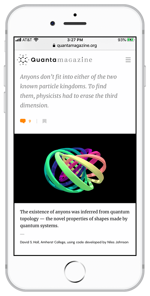
Quanta illustrates concepts with a mixture of 3D renderings and illustrations.
[/grid_column]
[/grid]
2. Use a Card-Based Layout
Card based layouts create a clear delineation between one post and another, making it easier for users to quickly scan the page and find something of interest.
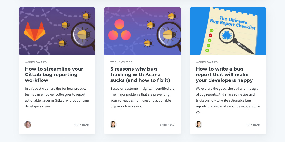
Marker uses cards effectively to display their blog posts.
Include the following:
- Featured image
- Blog Title
- Blog Author (link to all posts by this author)
- Blog Excerpt
- Post Date
- Category
- Read More Button (optional)
3. Write Thoughtful Calls to Action
Call to action copy should be customized and engaging. These labels can repeat elements from the headline when it reinforces what the user can expect from the blog/article. “Read more” is uninspired and doesn’t prompt action. “Learn more about our rankings” is straightforward, informs the user about what they can expect, and is accessible.
4. Actively Use a Formal Taxonomy
“Meaningful relationships between items on your site help guide your users in ways that have relevance and make sense.”*
Consider applying multiple terms to individual content pieces. Each category should be linked to an archive of articles that are categorized with the same terms.
For example, on a blog post about the Flu and Tamiflu, Cleveland Clinic applied the following categories:
Colds, Flu, Flu Season, Flu Shot, Flu Vaccine, Tamiflu
Why is this important? Users search for information about the same topic using different keywords. Applying a taxonomy that reflects this variety helps users find the content they seek.
5. Implement Intuitive Navigation Elements
Early blogs were criticized for having only one way of navigating, which often took the form of “next post” or “previous post” links.
Implement common blog design patterns such as:
- archives
- categories/taxonomies
- a blog-specific search to increase usability and support content “re-finding”
- a section to display related posts
- a section to display trending topics or posts, based on actual analytics
- a featured post section to draw attention to the latest and greatest content
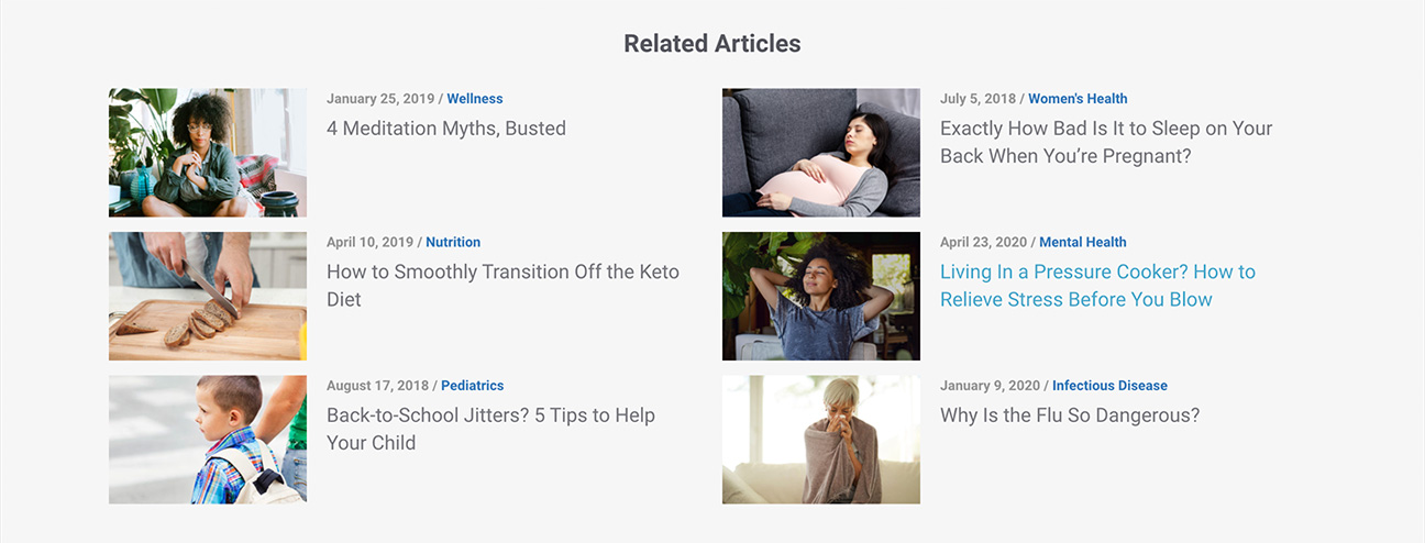
Cleveland Clinic follows each blog post with a grid of related blog posts, to encourage engagement.
6. Leverage Space for Conversion
The sidebar of the blog and individual posts should include a graphic callout prompting users to sign up, shop, or otherwise convert from casual user to customer. It doesn’t have to be loud and obnoxious, but it should use plain language to appeal to user needs.
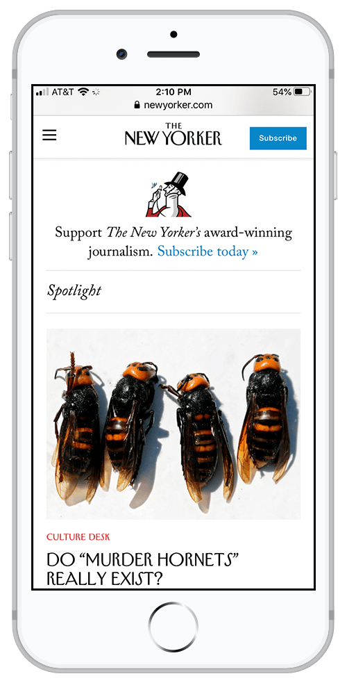
The New Yorker includes a call to action to attract new subscriber, while being true to their refined aesthetic.
7. Implement Social Sharing
Make it easy for users to share content they find compelling.
Social sharing buttons should be available at the top and the bottom of the post. Alternatively, they can be a floating element tied to the left or right sidebar that remains fixed in the viewport as the user scrolls.
On mobile, consider anchoring social share buttons at the bottom of the screen.
8. Add Reading Times
Reading times can help users decide if they have enough time to commit to an article or blog post.
Pro: this can encourage readers to click.
Con: if the read time is too long, readers may be discouraged.
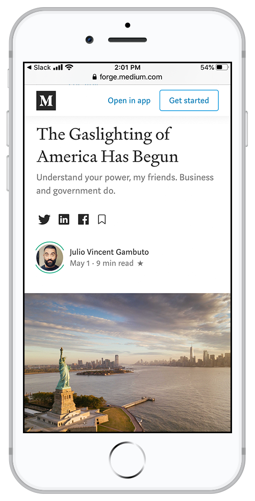
Medium was one of the first platforms to introduce reading times.
9. Add a Newsletter Subscription Feature
If possible, develop a weekly or monthly newsletter that sends out the latest posts to interested readers. Make it easy for users to sign up and get updates sent straight to their inbox. Use a product like MailChimp. The learning curve is not too steep and you will be able to maintain your list and allow users to opt in and opt out.

Miro offers a streamlined, elegant newsletter sign up form so users can stay up to date and learn how to collaborate.
10. Promote Discussion
Comments can help drive traffic to your blog and make users feel like they are part of the conversation. Of course, moderating comments is a time-consuming process, so if you can’t keep an eye on responses and interact with your readers, turn comments off.
11. Baseline Components for Individual Blog Posts
While many of these suggestions may seem obvious to a designer or marketer, it is astonishing how many websites miss out on these best practices. Finally, a simple list of what we consider to be crucial components on individual blog posts:
- Title
- Author Name
- Intro/Summary Sentence
- Article Text (obviously…)
- Supporting Images/Video/Interactive Elements
- Downloadable Elements (if appropriate)
- CTAs (when appropriate)
- Links to related content (caveat: you may want to add this after your blog has a substantial amount of related content)
- Social Share Buttons
- Links to categories/tags
- Ability to subscribe to a newsletter (if feasible)
Words are wonderful. Words move people, but words are not enough. A thoughtful design helps users digest words, learn, and share them. Happy blogging!