I recently learned about Ilse Crawford through the Netflix series Abstract: The Art of Design and was immediately taken with both her way of viewing the world through interior design as well as how much her perspective makes equal sense in the world of user experience design. One hour of listening to her talk only caused me to take a deeper dive into all the interviews I could find. The result of all that research is this blog post (and possibly several more) in which I hope that you, too, will be inspired by the possibilities and meaningfulness of human-focused design. All quotes are from Ilse Crawford and are cited accordingly (just in case you’d also like to indulge in her brilliant way of thinking).
Wellbeing over aesthetics
“All our projects start with a strategy. Basically prioritizing people, putting the human experience at the beginning of the design process.” Source
For anyone in the creative or software industry this sounds like the beginning of a user experience conversation, but it’s actually the beginning of an empathetic and wellbeing-focused approach to interior design from London-based designer Ilse Crawford of Studioilse.
If you study Ilse Crawford’s design work you’ll likely notice two things pretty quickly: you can’t pinpoint a consistent design style or aesthetic but you do feel a consistent emotional response. That’s because style is not Ilse’s priority. Wellbeing is.
“We always prioritize the experience over the way something looks. [The spaces are] built on the connection to the place and how they can enhance and amplify our lives within them. And obviously when we work with commercial clients, that translates into a brand, but not because we’ve stuck a brand on it but because by building a design around the needs of the people using it it ends up being the life of the brand. They end up being a group of people with values that become expressed through the space, but it’s a consequence rather than sort of imposed.” Source
This way of thinking, empathy and wellbeing first, style and aesthetic second, is both a challenge and a reminder of the reason user experience designers have to deeply understand and advocate for the people who will experience and live with our designs.
Interrogation & Empathy
“When we first approach a project, we always hold off what our opinion is. So we ask questions. We watch a lot. We listen. I always say to my team, ‘We’ve got two eyes, two ears and one mouth and we should use them in that proportion.’ Through that process of interrogation and empathy we can understand really what it is we’re looking at.” Source
Most of the projects I’ve worked on begin with a requirements document that includes the what, how much, and when. We need all these things, but we also need to prioritize knowing who the users people are at the receiving end, what their lives are like, and how they feel (before and after our designs are present in their lives).
“We don’t have a style. We’re more interested in how we can create this sense of place, this evolving sense of place, and bring those unmeasurable values together with the measurables, in fact we see that as our task, to protect those going forward.” Source
Ilse’s design projects always begin with understanding the human experience through interrogation and empathy. They leave assumptions behind. They ask questions. They observe. They’re open to not knowing everything and, in fact, being surprised.
“I think what’s quite interesting about our approach, focusing on the human experience, focusing on real needs, and my big caveat there is it’s needs not wants, that I think is how you can make interiors that really in the end, you know, sort of create an embodiment of the life that will be lived in the place.” Source
The outcome of this investigative and empathetic approach is a human-centric understanding of how a designed experience can make people feel known and, ultimately, how it can make their lives better. Having this mindset within a creative agency is equally beneficial for anything from a website to a rebrand to a video.
Take a look at a few of Studioilse’s projects and note her people-centric approach that guided the design decisions throughout the design process.
Anna Freud Center, London
“In London, we’re working on a family mental health center. We researched and asked ourselves if it should be brightly colored, upbeat, and optimistic. We talked to families who want something solid, familiar, and lasting. We’re making this project very warm, reassuring, safe, and welcoming.” Source
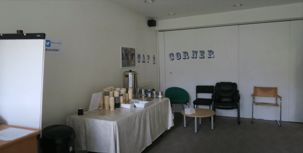
Anna Freud Center, London, before, Source
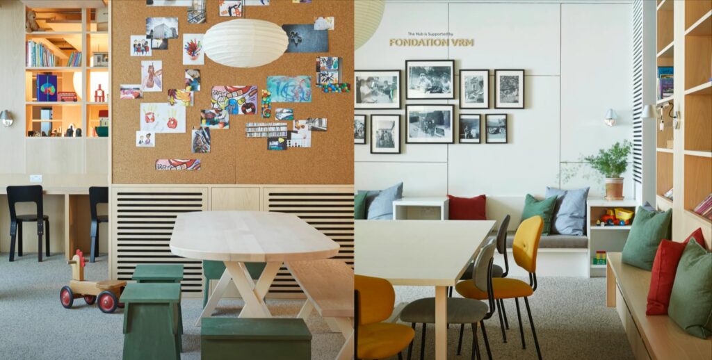
Anna Freud Center, London, after, Source
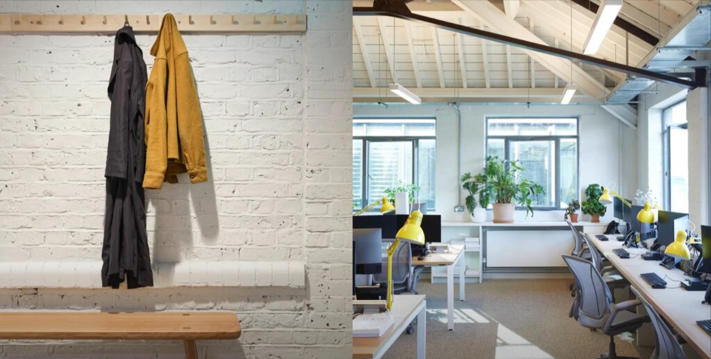
Anna Freud Center, London, after, Source
Refettorio Felix, London
When redesigning the Refettorio Felix soup kitchen in London, Ilse commented: “It’s an extraordinary project which basically integrated design with an attitude to food, but fundamentally an attitude to people. The idea that the brief was to bring dignity around the table; to bring beauty into a social sector that is not, generally speaking, you know discussed in that way. That actually it’s really about creating a frame for people to come together.” Source
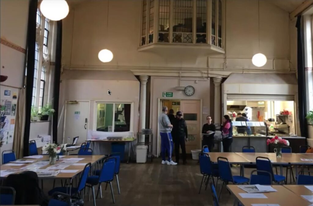
Refettorio Felix in London, a soup kitchen, before, source
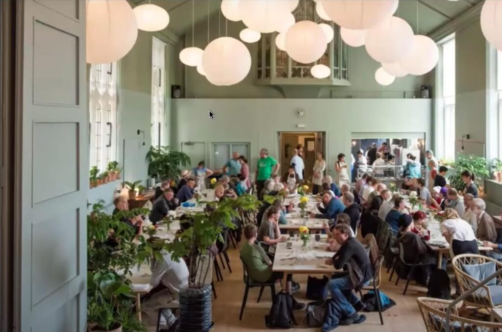
Refettorio Felix in London, a soup kitchen and community center, after, source
Cathay Pacific Airport Lounges
“Moving on from the very old fashion idea of luxury to being something that really was genuinely hospitable to the people that were using it, that addressed their wellbeing. I mean we had stacks of data, but in the end I think the most useful thing was actually just to sit in the lounges and talk to people. You know, to listen, to watch, to ask questions, and understand how they were feeling. I mean they looked knackered. Understanding what that meant in the context of their lives in terms of how that could then be reimagined in terms of a place that could support their daily working lives. It was really interesting how you could bring well-being into that.” Source
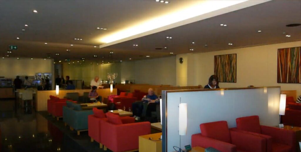
Cathay Pacific airport lounge, before, Source
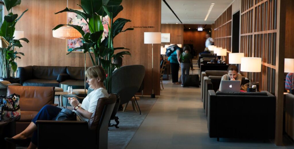
Cathay Pacific airport lounge, after, Source
Prioritizing both people and business goals
The what, how much, and when of a requirements document are much more concrete, measurable, and familiar than the human experience, but honing in on the human experience and committing to a set of unmeasurables (i.e. feelings) at the start forces designers and clients to constantly keep themselves in touch with the human side of things throughout the design process.
Here are a few ways to get started:
-
Feel.
At the beginning of the project, ask the client and designers to discuss and commit to a set of feelings that the final project should evoke from the people who will experience the design in the end and use those feelings as a non-negotiable framework for all design decisions throughout. It will empower both the designers and the clients to easily say “yes” and “no” throughout the process and keeps both parties committed to a clear human-focused end goal.
-
Craft.
Challenge yourself to think of design as a way to craft better human experiences, rather than to create something visually appealing (this doesn’t mean the end result won’t be attractive, it simply isn’t the ultimate goal).
-
Interrogate.
Leave your assumptions at the door and start investigating. Ask all kinds of questions about the project (seemingly obvious ones are often the most enlightening!). Don’t accept things for the way they’ve been done before. Ask why. Remember that your way of thinking and perceiving the world are not the only way; different ways of thinking are not a threat or a burden, they are simply different.
-
Empathize.
If possible, put yourself in the current experience of the people for whom you are designing. Although data and anecdotes are valuable, there’s nothing more valuable than people-watching, seeing things first-hand, and getting in someone else’s shoes. (For example: I recently drove a self-driving car and quickly realized how much my perception of the experience was missing so many emotional factors in comparison to actually being in the experience!)
-
Commit.
Revisit and recommit to the agreed upon feelings that the design should evoke. One of the most challenging parts of keeping feelings at the center is that it requires designers to check in emotionally instead of simply adhering to design standards and defaulting to trendy, of-the-moment aesthetics.

