UScellular

We made activating a phone an enjoyable experience!
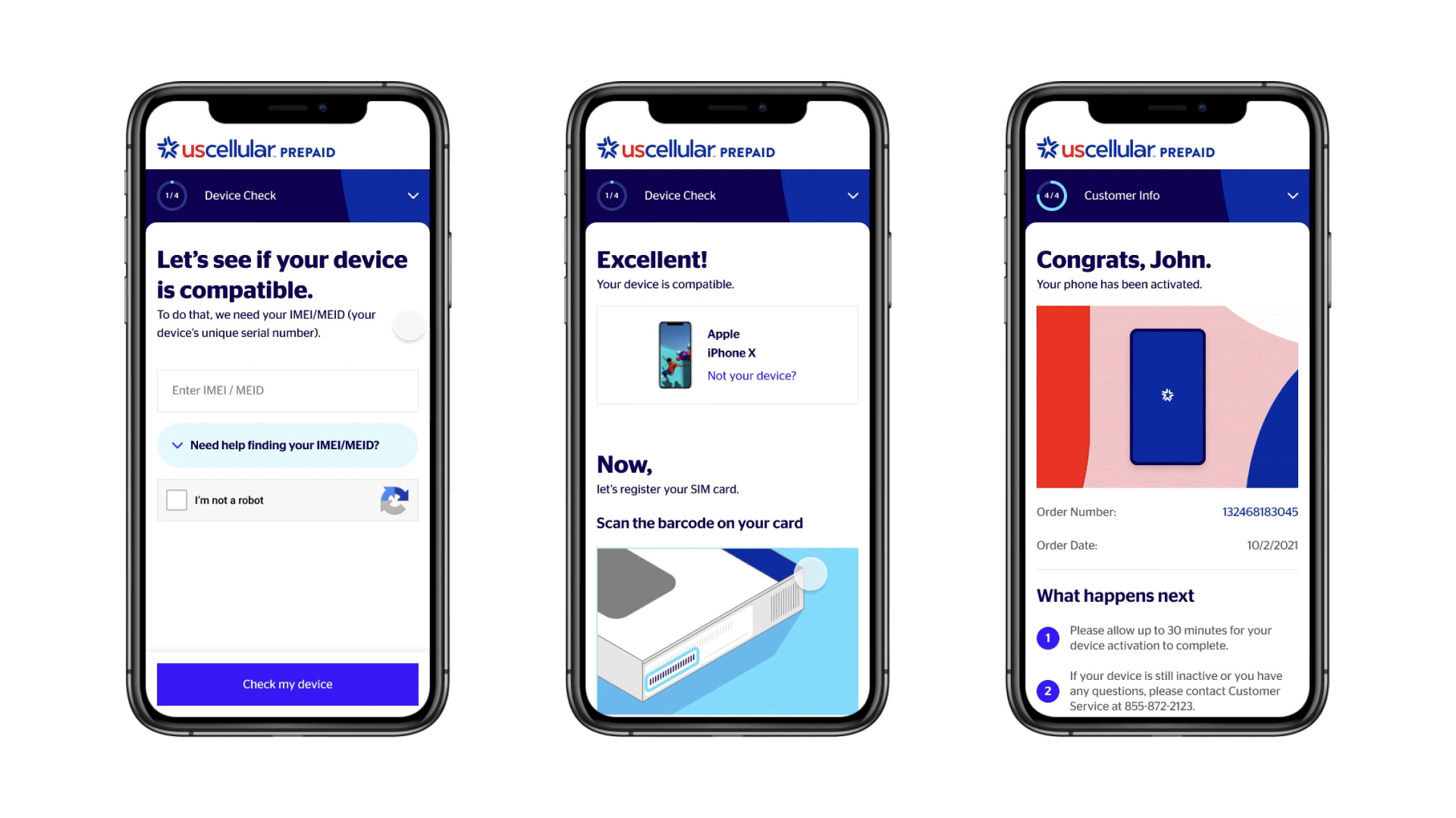
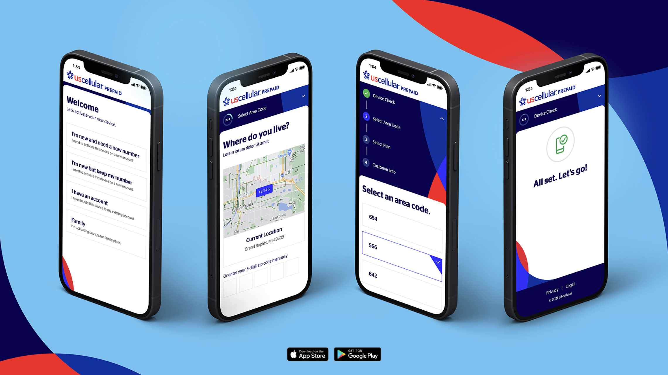
A guy walks into a Walmart, buys a UScellular iPhone right off the shelf, and goes home. He stares at it for a while. Now what? How does he activate this thing?
Without a helpful, well-designed application dedicated to powering up their device, customers had to use the obsolete UScellular Pre-Paid activation webpage or go through the call center. A better way was possible.
We employed human-centered UX principles to design a frictionless activation app experience for pre-paid customers.
We wrote friendly and conversational copy that makes customers feel like they are connecting with a human company.
The Result? A modern and seamless app that both reflects UScellular’s brand values and their commitment to delighting their customers.
component design
We first built the kit of parts and styles that would populate the activation flow, including all the reusable elements like headers, footers, form fields, buttons, icons, and type. This evolved as the new brand identity was released piece by piece.

screen design + prototyping
We designed all the base screens and their modified states to accommodate various user journies and connected the interactions to create an interactive prototype. In that process, we were able to diagnose all potential user journey issues before it got to development AND provided the development team with a clearer understanding of expected interactions, flow, transitions, etc.

services
related case study
memento
