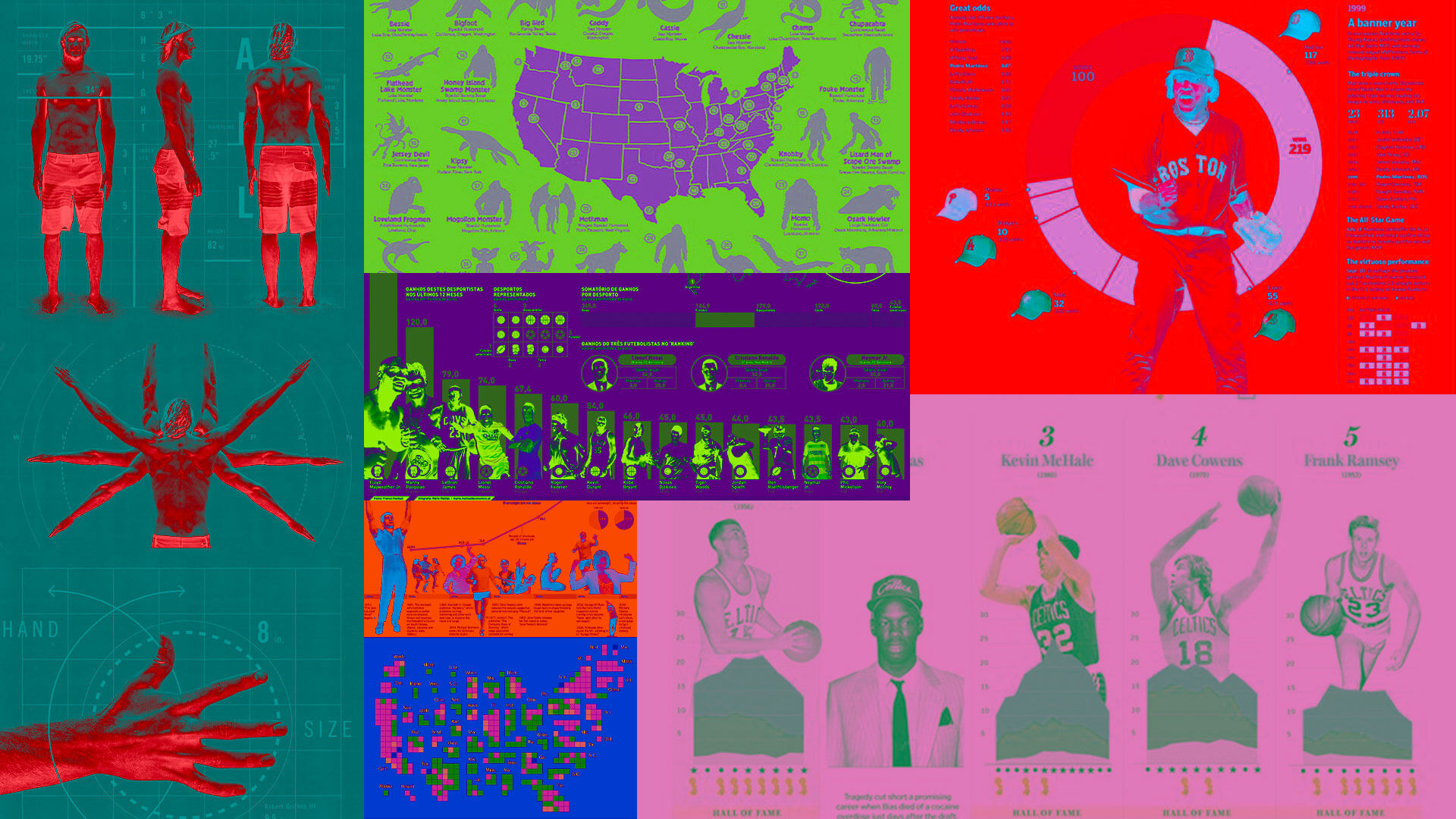
Hero Image Credit: Italic Studio, Hog Island Press, The New York Times, and The Boston Globe.
Your favorite deliverable, the “infographic”, is a dirty word. It’s offensive because you’re using it wrong. Most people have a different understanding of what an infographic is. Or they ask for one when the content isn’t right for an infographic.
I’m here to put the soap in your foul mouth. In this article, I’ll help define an infographic, tell you what makes a good infographic, and discuss common mistakes. Let’s make infographic a good word. The kind of word you’d say to your mother.
What is an infographic?
The Merriam-Webster Definition:
Infographic (in·fo·graph·ic) noun: a chart, diagram, or illustration (as in a book or magazine, or on a website) that uses graphic elements to present information in a visually striking way.
Our definition of an infographic:
An infographic is a visually creative execution of data.
Let’s dive deeper into that.
Infographic = Data Creative
(Or creative data visualization)
Infographics and Data Visualizations are similar. However, there is one distinct differentiator: the “creative” factor.
Data visualizations (like charts and graphs) can be part of an infographic, but what makes it an infographic is the addition of creative. Let’s break down these two pieces, data + creative.
Data (The info)
This good four-letter word is the meat of the content. Examples include: statistics, instructions, dates, progressions, evolutions, processes, etc.
+ Creative (The graphic)
The visual design and storytelling factor. Examples include story, branding, photography, illustration, graphic elements, etc.
= Infographic
The final creative portrayal of your data might be a chart, graph, flowchart, list, map, sequence, timeline, or illustration. It is data via storytelling and creative visuals instead of data via scientific or mathematical expressions.
The word infographic can be a frustrating deliverable for designers because every client has a different understanding of what that means. We are not always on the same page, and even when we are, there seems to be a lack of good content to fulfill that vision.
Content
It’s our responsibility (the design agency) to bring the creative part. It’s our shared responsibility to find content that will be best conveyed by infographics. The best content for infographics is data. Numbers are great. What’s even better are numbers with relationships or comparisons to give them better context.
Does your content have data? Do those numbers relate to each other somehow? Percentages are great because they have an inherent relationship to another number (100%) – 27% has a relationship to 100% that we can visually convey.
These are flat numbers. Flat numbers have no connection, correlation, or association with other numbers. There is no added context here. Without that context, we’re missing a creative design opportunity. This example is purely type design. Not an infographic. We could add imagery or iconography here to make it an infographic, but it would still be missing the contextual content to make it a GREAT infographic.
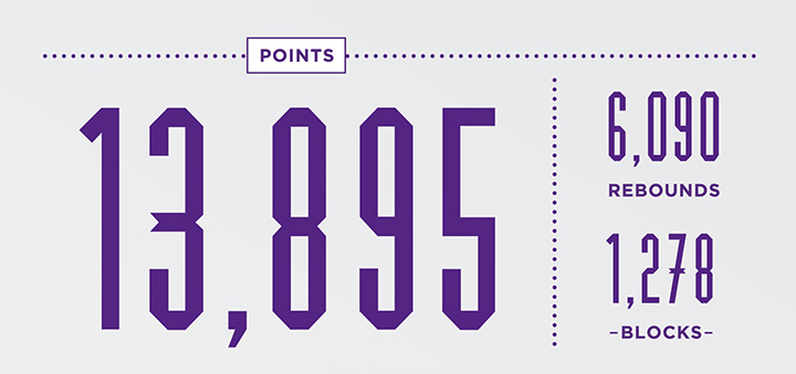
Credit: J Alexander Diaz / Los Angeles Lakers
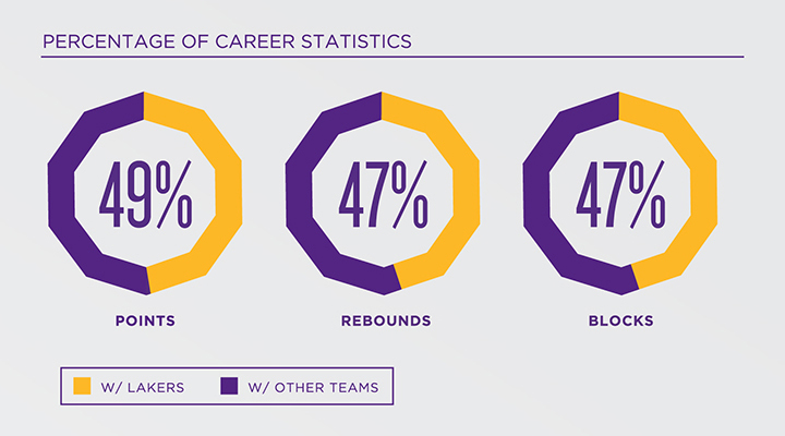
These are numbers with additional context, but there is no creative here. Therefore it is a data visualization. Not an infographic.
Here is a good content example:
- We have 12 products we offer our clients.
We can visually convey “12 products” via photography, iconography, illustration, or graphics.
GREAT content examples include at least one contextual number/factor:
- We have 12 products we offer our clients. Double the amount we had just 2 years ago.
- We have 12 products we offer our clients. Our competitors only offer 2-3 comparable products.
- We have 12 products we offer our clients. They are priced in 3 tiers…
- We have 12 products we offer our clients. They connect to these 4 industries…
- We have 12 products we offer our clients. They each require X hours of onboarding…
Scale
Now that you have an understanding of the best kind of content, let’s talk scale. Sometimes clients provide very little content or data but expect to see a large multi-sectioned infographic.
This is one great infographic (single). It compares the average altitude of various aircraft.
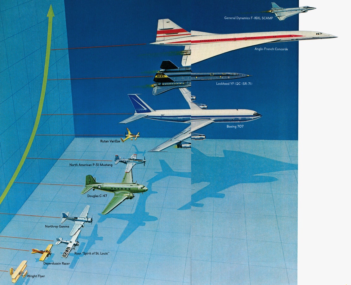
Credit: National Geographic
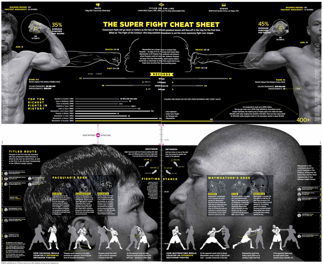
This is also one great infographic (multi) made up of many individual infographics.
Credit: Adonis Durado
It is not a measure of scale or complexity that makes something an infographic. An infographic can present itself as a single stat or a deeper design built from dozens of facts and figures.
Summary
Infographics are an engaging way to convey statistics and complex information. They can be designed for ads, posters, web pages, social posts, documents, and more. They are more than data visualizations, thrive on statistical content with context, and can vary in scale. No longer vulgar, obscene, or profane, the infographic can now be the good word sung on high.
Equipped with this info and the definition of an infographic, we can now speak the same graphic language.

